# A tibble: 5 × 2
   Year Metric_tons
  <dbl>       <dbl>
1  1969         400
2  1970         400
3  1971         500
4  1972         500
5 1973 500Input data

When creating a ggplot2 object two pieces of information are vital:
- Input data: A tibble/data.frame in a long format
- Aesthetics: Specifies which columns of the input data are used for the different parts of the plot
This page describes the input data whilst the next describes aesthetics.
Long/tidy data
When using tidyverse packages we are primarily working with tidy/long data. This is by design.
Purpose of long/tidy data
There is a definite learning curve to using tidy/long data. We humans have used messy/wide data for most of our education and so tend to find it more intuitive.
The purpose of tidy/long data is to:
- Make data manipulation and analysis more consistent
- Reduce the overall time spent on cleaning and preparing data
There are many ways to have data formatted in a wide/messy format but only a few ways to have data in a long/tidy format.
Format of long/tidy data
Although hard to give a specific definition, tidy/long data have the three following features:
- Each variable is a column; each column is a variable
- Each observation is a row; each row is an observation
- Each value is a cell; each cell is a single value
In essence you never want column names to be values, rather having those values inhabit the cells of a column/variable. For example, instead of 10 columns of ten different years (1990, 1991, 1993, etc) where the cell values are the fish metric ton values you would have:
- A column/variable called
Yearcontaining the years as values - A column/variable called
Metric_tonscontaining the fish metric ton values - Each
Yearvalue and correspondingMetric_tonsvalue would be one observation/row
The below tibble shows a small slice of this tidy/long tibble.
To go from wide/messy to long/tidy you can use the function tidyr::pivot_longer().
The long and wide of it
If long/tidy data is so great why do we still use wide/messy data?
Although long data is very useful in R it is not as human readable as wide/messy data. When learning maths, stats etc., or displaying tables it is better/easier to use wide data. In other words:
Messy humans like messy data. Tidy computers like tidy data.
Matthew R. Gemmell
Links with more information:
Tidy/long data examples
Below are two examples of tidy/long data.
One continuous column
Many common plots require a tibble where all the continuous/numerical values are in one column whilst the other columns contain categorical data (i.e. metadata). An example includes a box plot of weight (kg) against age ranges (teen, adult etc.).
The below code blocks creates an example tibble and a box plot with the data.
Note: set.seed() is used to have consistent randomness for the rep() function. It is good practice to set the seed to its normal operation afterwards with set.seed(NULL).
#Create tibble
set.seed(6836)
age_range <- rep(c("teen","adult", "Middle age adult", "Senior adult"), 25)
weight <- sample(150:195, size = 100, replace=TRUE)
weight_age_tbl <- tibble::tibble(weight, age_range)
set.seed(NULL)
#Display top of tibble
head(weight_age_tbl)
# A tibble: 6 × 2
weight age_range
<int> <chr>
1 194 teen
2 190 adult
3 159 Middle age adult
4 171 Senior adult
5 162 teen
6 167 adult #Boxplot
ggplot2::ggplot(weight_age_tbl, aes(x=age_range,y=weight)) +
ggplot2::geom_boxplot()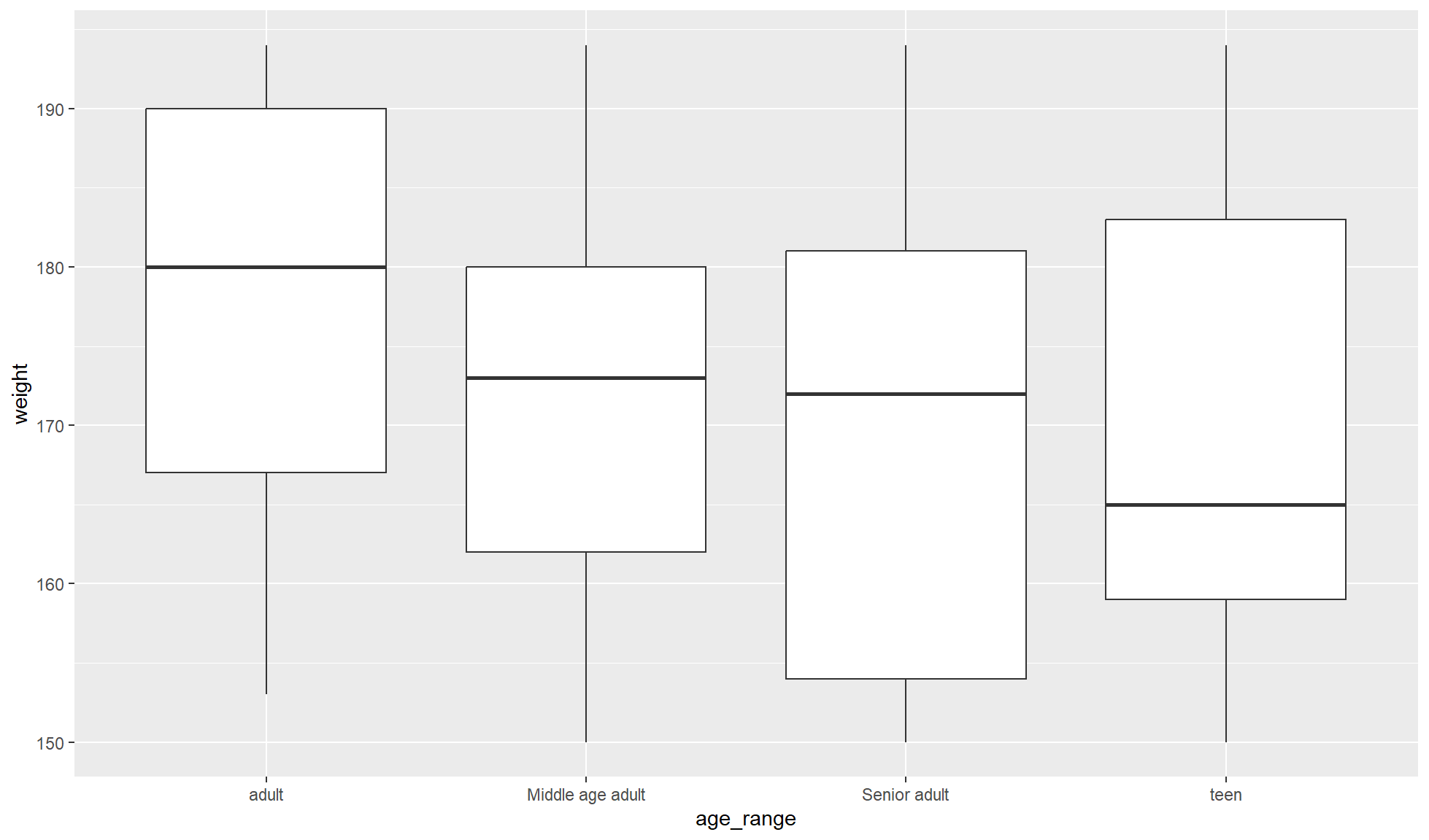
Multiple continuous columns
The format of columns in your long tibble is highly dependant on your specific data and the type of plots you will create. For example, you may have a scatterplot comparing 2 continuous measures from 2 different columns (e.g. height vs weight). In this case each row would contain the height and weight of one individual.
The below code blocks creates an example tibble and a scatter plot with the data.
#Create tibble
set.seed(6836)
weight <- sample(150:195, size = 100, replace=TRUE)
height <- sample(50:130, size = 100, replace=TRUE)
set.seed(NULL)
weight_height_tbl <- tibble::tibble(weight, height)
#Display top of tibble
head(weight_height_tbl)
# A tibble: 6 × 2
weight height
<int> <int>
1 194 116
2 190 90
3 159 130
4 171 127
5 162 78
6 167 58#Scatterplot
ggplot2::ggplot(weight_height_tbl, aes(x=weight,y=height)) +
ggplot2::geom_point()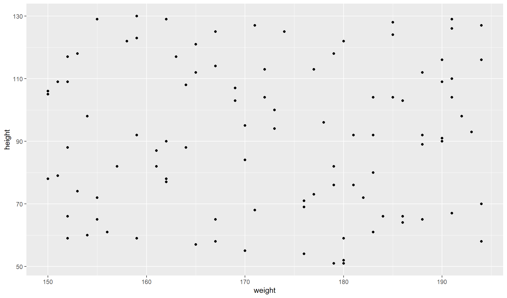
In this case there seems to be no linear correlation but that is because we randomly created the dataset in a very naive manner.
The surface
The above is a very brief intro to the input data of ggplot2. We could show more here but it is better/easier to demonstrate with more examples as we introduce more topics.