crop_and_soil_tbl <- mgrtibbles::crop_and_soil_tbl |>
    #Separate wider
    tidyr::separate_wider_delim(Temperature_celsius_kelvin, delim="_",
    names = c("Temp_celsius", "Temp_kelvin")) |>
    #Mutate across the two columns to convert them to numeric columns
    dplyr::mutate(dplyr::across(Temp_celsius:Temp_kelvin, as.numeric)) |>
    #Slice first 50 rows
slice(1:50)Aesthetics

When creating a ggplot2 object two pieces of information are vital:
- Input data: A tibble/data.frame in a long format
- Aesthetics: Specifies which columns of the input data are used for the different parts of the plot
This page shows different aesthetics and their uses whilst the previous page describes the input data.
Aesthetics
The most important aesthetics are:
x: X-axis (continuous or categorical)y: Y-axis (continuous or categorical)shape: The shape of points (categorical)- There are 20 different shapes
colour: The colour of objects (continuous or categorical)- When used for points this is the stroke colour (i.e. outside line)
fill: The fill colour of objects (continuous or categorical)size: The size of shapes (continuous)linetype: The type of the lines (categorical)- There are 6 different line types including: solid, dashed, and dotted
linewidth: The width of the lines (continuous)
As you can see there are a lot of aesthetic options. Which you use will depends on your data and how you want to visualise it. Below are a few examples of using the various aesthetics.
Full list: Ggplot2 aesthetic specifications.
We’ll create a few scatterplots, changing the appearance of the points for different reasons.
Dataset
For demonstration we’ll load the crop_and_soil_tbl data from the mgrtibbles package (hyperlink includes install instructions). This contains:
- Three categorical columns:
Soil_type,Crop_type, andFertilisier - Five continuous column:
Humidity,Moisture,Nitrogen,Potassium, andPhosphorus - A combine column: The
Temperature_clesius_kelvincolumn contains the celsius and kelvin values.- This will be split into 2 columns
Categorical mappings
We’ll create a scatterplot for Humidity (x) against Moisture (y). On top of the x and y aesthetics we’ll set the shape to Crop_type and the colour to Soil_type to include categorical data in our plot.
crop_and_soil_tbl |>
    ggplot2::ggplot(aes(x = Humidity, y = Moisture,
                    colour = Crop_type, shape = Soil_type)) +
    ggplot2::geom_point()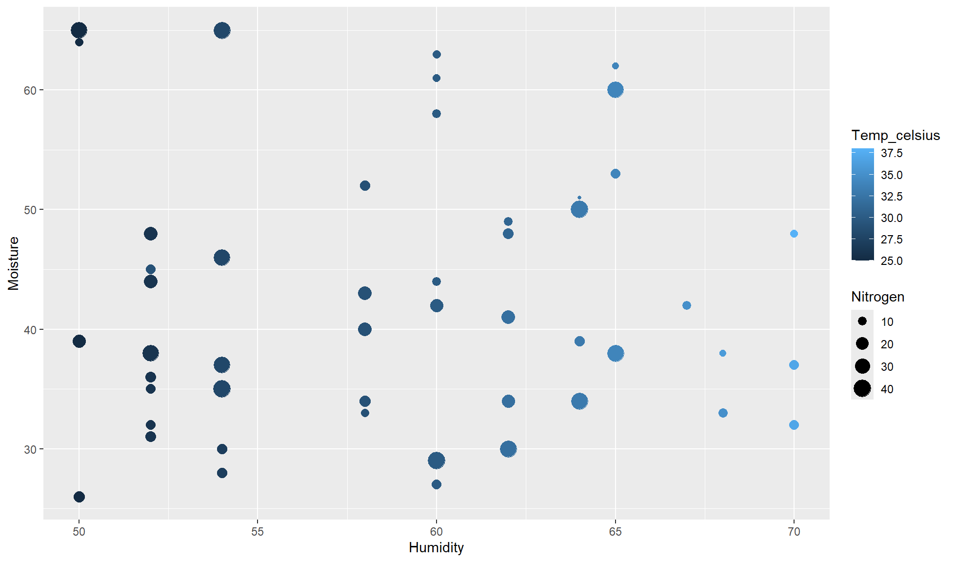
You’ll notice corresponding legends appear which is handy.
Continuous
Rather than mapping categorical values to extra aesthetics we can map continuous values.
The below code creates a scatterplot for Humidity (x) against Moisture (y). Additionally map:
Temp_celsiusto colorNitrogento size
crop_and_soil_tbl |>
    ggplot2::ggplot(aes(x = Humidity, y = Moisture,
                        color = Temp_celsius, size = Nitrogen)) +
    ggplot2::geom_point()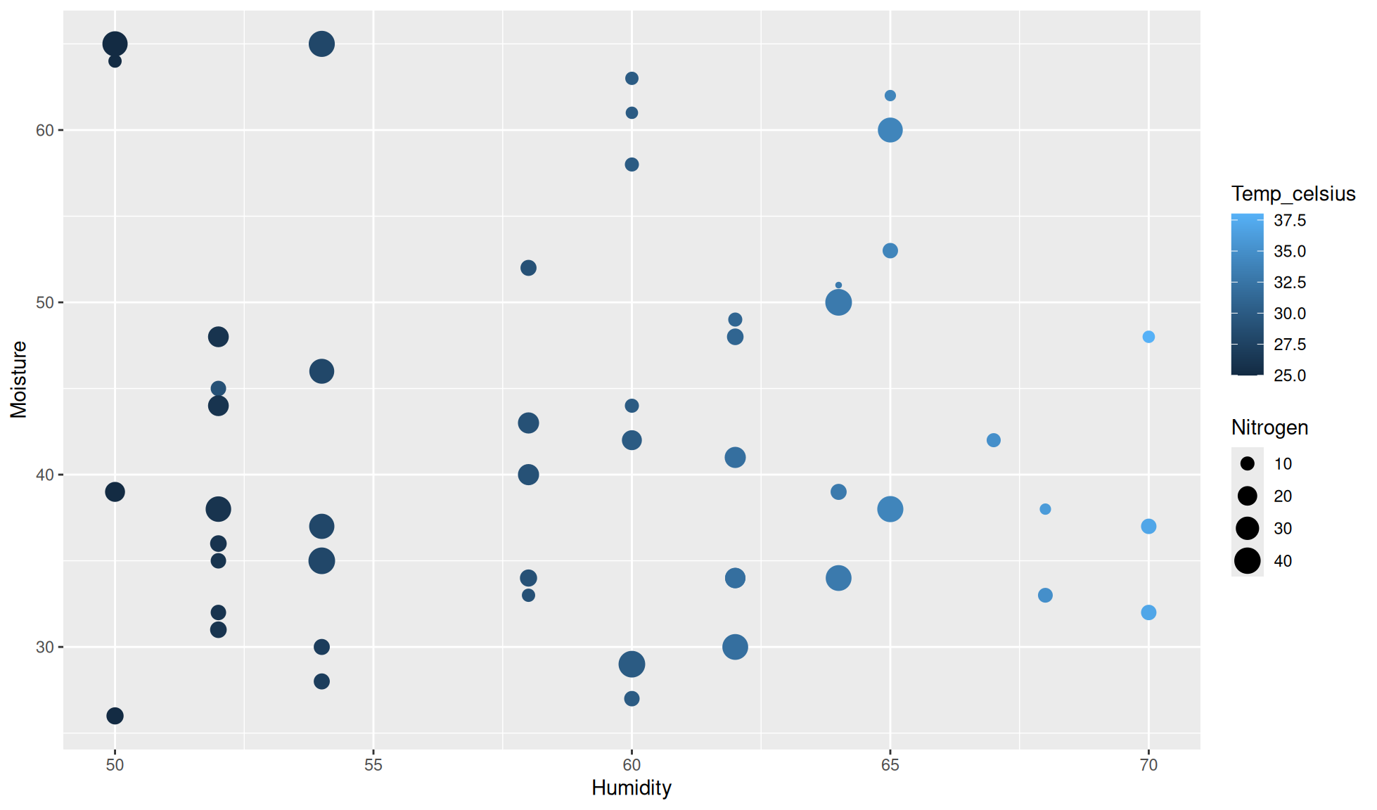
Calling aesthetic in layers
Primarily we set aesthetics in the ggplot2::ggplot() function. However, aesthetics can be set in a specific layers such as ggplot2::geom_boxplot(). This is useful to make different layers show different information.
Below is a quick example where the color aesthetic is set in geom_jitter() so the points are coloured by watershed but the violins are not.
hbr_maples |>
    #Drop na values
    tidyr::drop_na() |>
    #Violin plot of corrected_leaf_area (y) by elevation (x)
    ggplot2::ggplot(aes(x=elevation,y=corrected_leaf_area)) +
    ggplot2::geom_violin() +
    #Colour jitter points by watershed
    ggplot2::geom_jitter(aes(colour=watershed))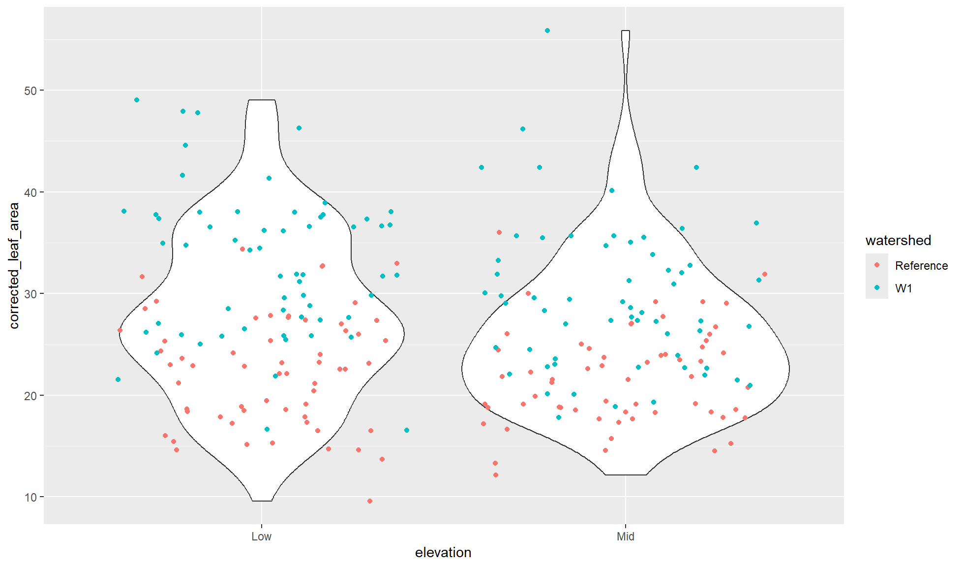
Correct use of aesthetics
There are many considerations when choosing which aesthetics to use including:
- How many different aesthetics can be used before the plot is too noisy
- Some aesthetics can only be used for continuous or categorical whilst others can be used for both
- How many categorical groupings can be effectively used for an aesthetic
- Although you could use 100 colours for 100 groups, the colours will be very hard to differentiate between
- Should you be using colour blind friendly palettes?
Some of these will be touched upon in this website. However, if you want more theory and examples I would recommend: