mammal_sleep_tbl <- mgrtibbles::mammal_sleep_tbl |>
    dplyr::select(body_wt, brain_wt, predation) |>
dplyr::filter(body_wt < 10 & brain_wt < 0.1)Components
One of the main principles of ggplot2 is starting with a relatively simpe plot and then adding components to add complexity/sophistication.
This is facilitated by being able to add components with +.
Dataset
For demonstration we’ll load the mammal_sleep_tbl data from the mgrtibbles package (hyperlink includes install instructions). For ease and clarity we’ll select the body_wt, brain_wt, and predation columns. Additionally, we’ll filter the rows to only retain observations where the body_wt is less than 10 and the brain_wt is less than 0.1.
Building up complexity
This page will demonstrate building a more complex ggplot2 plot by creating the following plots:
- A scatter plot
- A scatter plot with customised labels
- A scatter plot with customised labels, and a linear regression line
- A scatter plot with customised labels, a linear regression line, and linear regression equation
With these examples we will reuse the code of the previous example and add one component to include an extra feature to the plot.
For the official ggplot2 information about components please see: Intorduction to ggplot2
Scatterplot
First we will create a scatter plot. For this we will use 2 components.
The first component is the ggplot2::ggplot() function which must always be the first component. This will create the ggplot object from our dataset. Additionally, we will specify the aesthetics for our plot with this function.
The aesthetics can be specified in other components as you will find out in later sections.
The second component is the layer: ggplot2:geom_point(). This will create a scatter/point plot from our ggplot object.
When adding a new component we need to add the plus symblol (+) to the end of our previous component. It is very easy to miss a + when adding new components, especially if you add a component between other components. This is a similar principle to using |> for piping with other tidyverse packages and functions.
Create a scatterplot of body_wt (x) against brain_wt (y).
mammal_sleep_tbl |>
    ggplot2::ggplot(aes(x=body_wt, y = brain_wt)) +
    ggplot2::geom_point()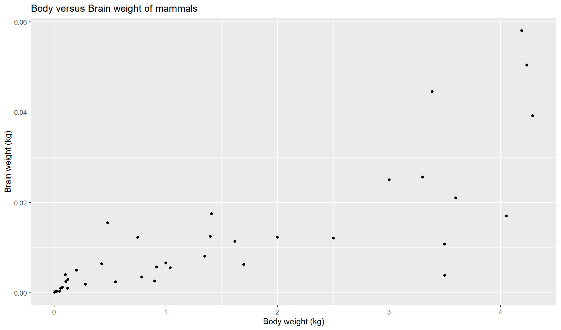
Add labels
Next we will customise the x and y labels and add a title with the ggplot2::labs() component/function.
mammal_sleep_tbl |>
    ggplot2::ggplot(aes(x=body_wt, y = brain_wt)) +
    ggplot2::geom_point() +
    ggplot2::labs(x = "Body weight (kg)", y = "Brain weight (kg)",
                title = "Body versus Brain weight of mammals")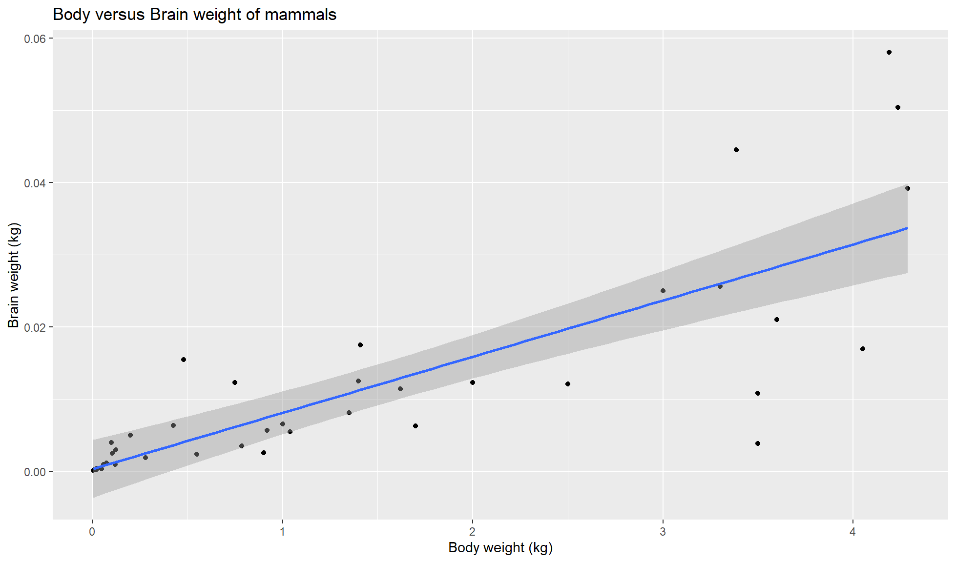
Add linear regression line
Our fourth component is geom_smooth(method = 'lm). We’ll use it to add a linear regression line to our plot. This needs to be somewhere below the ggplot2::geom_point() component.
mammal_sleep_tbl |>
    ggplot2::ggplot(aes(x=body_wt, y = brain_wt)) +
    ggplot2::geom_point() +
    ggplot2::geom_smooth(method='lm') +
    ggplot2::labs(x = "Body weight (kg)", y = "Brain weight (kg)",
                title = "Body versus Brain weight of mammals")
`geom_smooth()` using formula = 'y ~ x'
Add linear regression equation
Finally we will add the linear equation on top of our plot.
Before adding the component we’ll create the equation with the below code using lm().
#Calculate linear model
brain_body_lm <- lm(brain_wt ~ body_wt, data = mammal_sleep_tbl)
#Extract interecpt (c) and gradient (m)
c <- brain_body_lm$coefficients[1]
m <- brain_body_lm$coefficients[2]
lm_equation <- paste0("y = ",as.character(m),"x + ",as.character(c))
lm_equation
[1] "y = 0.00777559192393856x + 0.000346929649518692"Now we can add a text annotation of the equation with ggplot2::annotate().
mammal_sleep_tbl |>
    ggplot2::ggplot(aes(x=body_wt, y = brain_wt)) +
    ggplot2::geom_point() +
    ggplot2::geom_smooth(method='lm') +
    ggplot2::annotate("text", x = 1.5, y = 0.05, label = lm_equation) +
    ggplot2::labs(x = "Body weight (kg)", y = "Brain weight (kg)",
                    title = "Body versus Brain weight of mammals")
`geom_smooth()` using formula = 'y ~ x'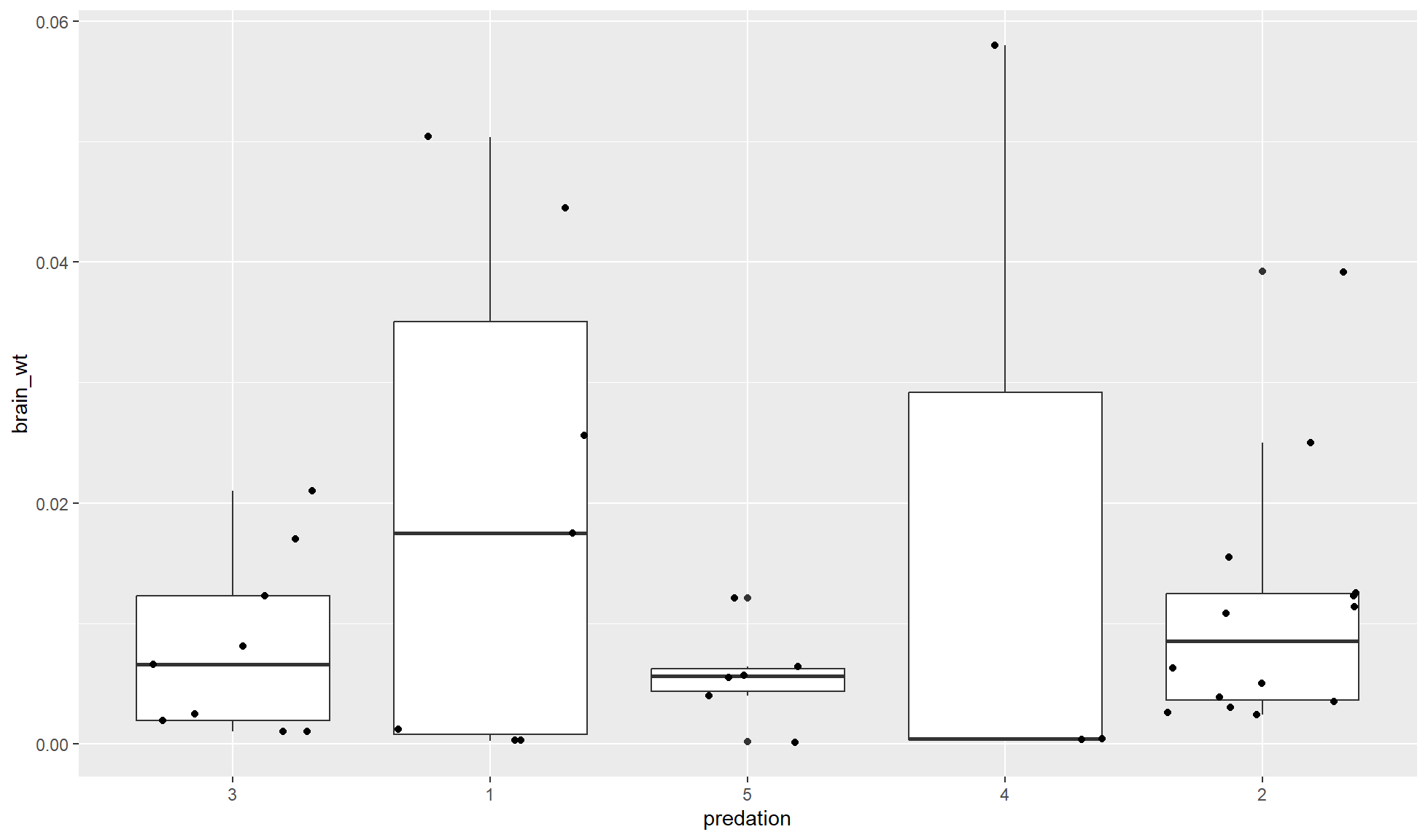
Order of components
The order of your components in your code can effect the final output.
Order of component types
Generally many order their components as so:
- Creation: The
ggplot2::ggplot()must be the first component to create aggplot2object. - Layers/geoms
- Scales
- Facets
- Coordinates
- Theme
Note: Many of the above types of components are covered in later sections.
Order of layers
The order of components of the same type (e.g. layers/geoms) can drastically change a plot.
Layers/geoms will be overlayed on top of each other. A layer added after another one will be on top. In other words, the first layer will be below the second which will be below the third etc.
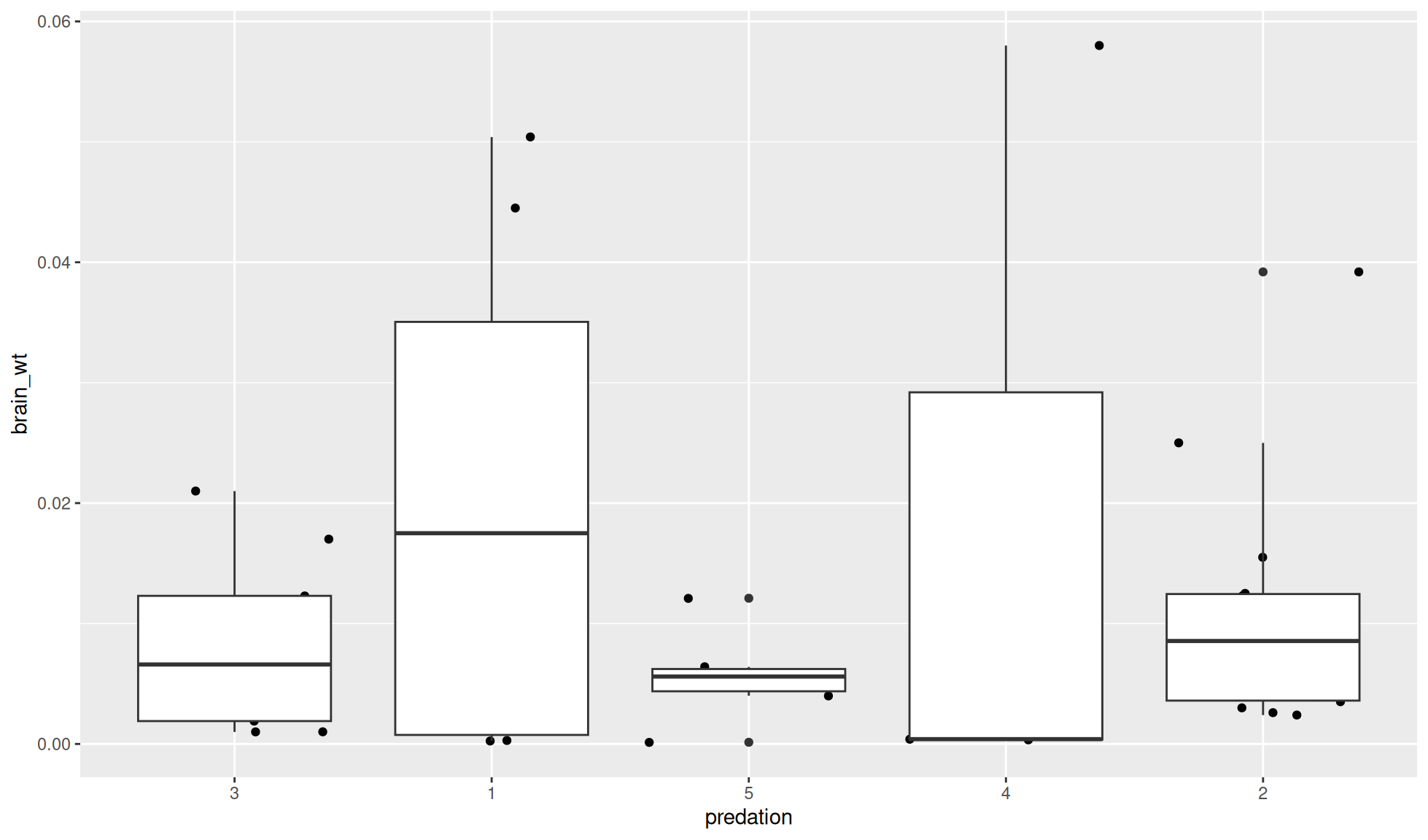
If you want to have a boxplot (ggplot2::geom_boxplot()) with the points (ggplot2::geom_jitter()) on top of the boxes, geom_boxplot() needs to be called as a component before (i.e. above) geom_jitter() in the code.
mammal_sleep_tbl |>
    ggplot2::ggplot(aes(x=predation, y = brain_wt)) +
    #First layer is below the second layer
    ggplot2::geom_boxplot() +
    #Second layer is above the first layer
    #Adds horizontal (x) space between points
    # to reduce number of points overlapping
    ggplot2::geom_jitter()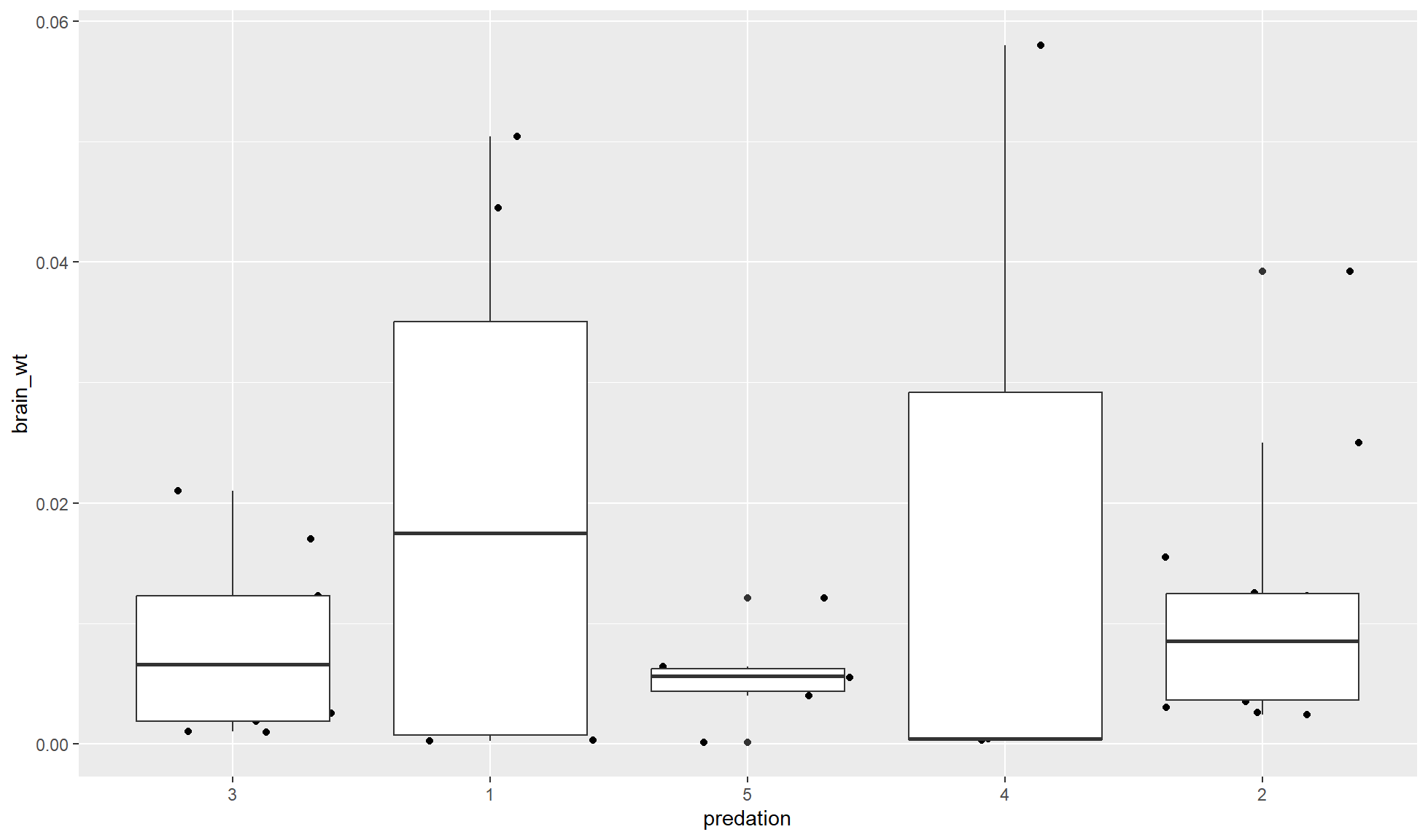
If you add the box plot layer after the points layer the boxes will be on top.
mammal_sleep_tbl |>
    ggplot2::ggplot(aes(x=predation, y = brain_wt)) +
    #First layer is below the second layer
    ggplot2::geom_jitter() +
    #Second layer is above the first layer
    ggplot2::geom_boxplot()