#Load package
library("mgrtibbles")
#Set seed for random sampling
set.seed("483")
#mushroom_tbl tibble for demonstration
mushroom_tbl <- mgrtibbles::mushroom_tbl |>
    #Random sample of 150 rows
    dplyr::slice_sample(n = 150, replace=FALSE)
#Reset random seed to normal operation
set.seed(NULL)Geom point
Scatter plots are commonly used to display the relationship between two continuous variables.
In this page we will create scatter plots with ggplot2::geom_point(). Through examples we will demonstrate creating:
- A default scatter plot to plot two continuos variables against each other
- A scatter plot with the points coloured by a categorical variable
- A scatter plot with the colour and shapes of points determined by 2 categorical variables
- A scatter plot with the size of the points representing a third continuous variable
Dataset
For demonstration we’ll load the mushroom_tbl data from the mgrtibbles package (hyperlink includes install instructions). We will extract a random sample of 150 rows with slice_sample().
Default scatter plot
Create a scatter plot of stem_height (y) against stem_width (x).
mushroom_tbl |>
    ggplot2::ggplot(aes(x = stem_width, y = stem_height)) +
    ggplot2::geom_point()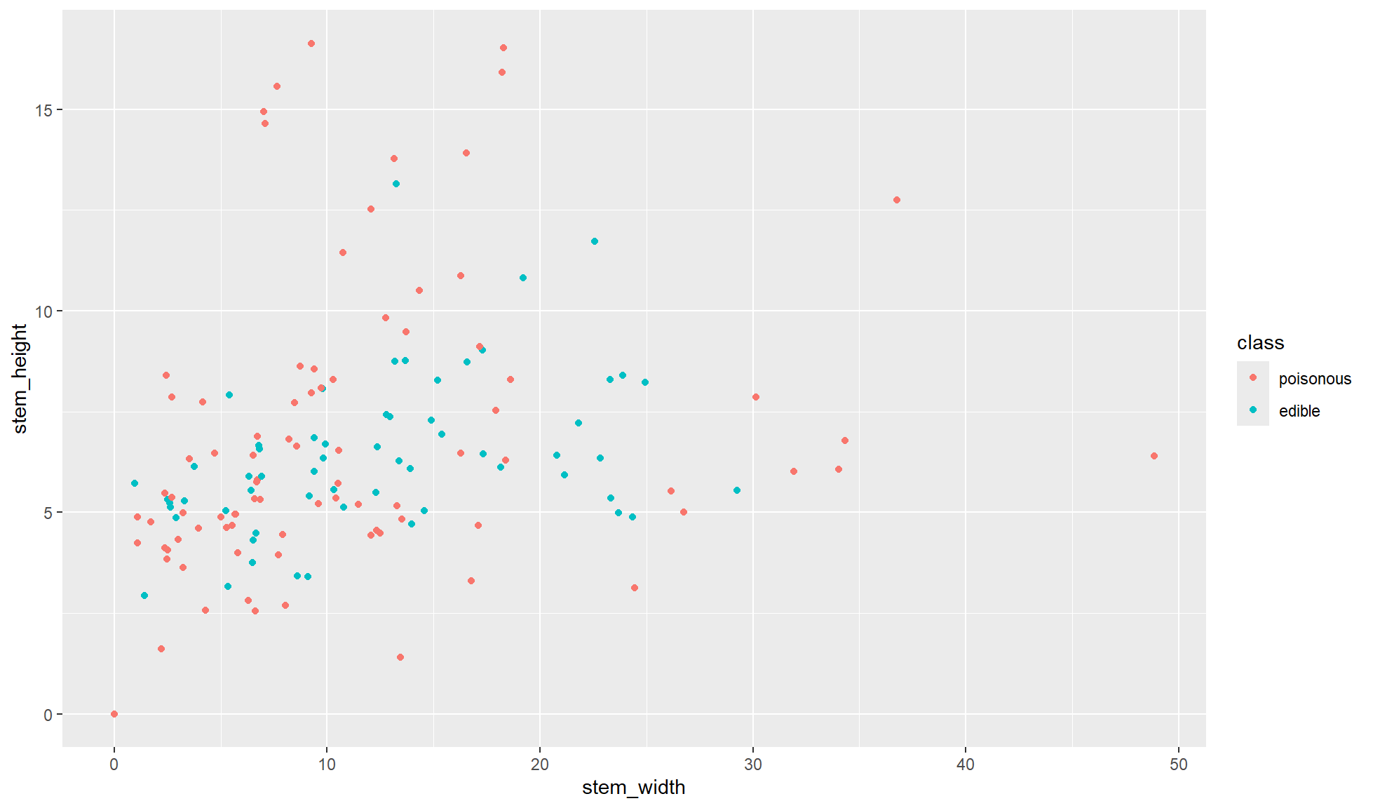
Colour groups
When displaying a single categorical variable it is normally best practice to use the colour aesthetic.
Create a scatter plot of stem_height (y) against stem_width (x). In aes() set colour=class so each point is coloured by whether its is edible or poisonous.
mushroom_tbl |>
    ggplot2::ggplot(aes(x = stem_width, y = stem_height, colour = class)) +
    ggplot2::geom_point()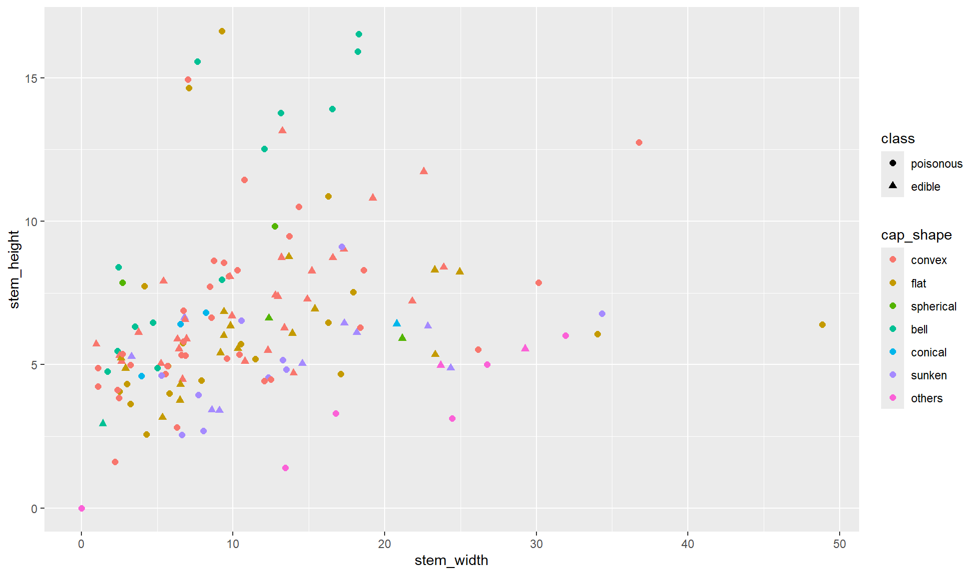
Colour & shape groups
When displaying 2 different categorical variables in a scatter plot it is common to use colour and shape. I advise using colour for the variable with more groupings.
Create a scatter plot of stem_height (y) against stem_width (x). In aes() set colour=cap_shape and shape=class. Additionally, make the point sizes larger with size=2 in the ggplot2::geom_point() function.
mushroom_tbl |>
    ggplot2::ggplot(aes(x = stem_width, y = stem_height,
                    shape = class, colour = cap_shape)) +
    ggplot2::geom_point(size = 2)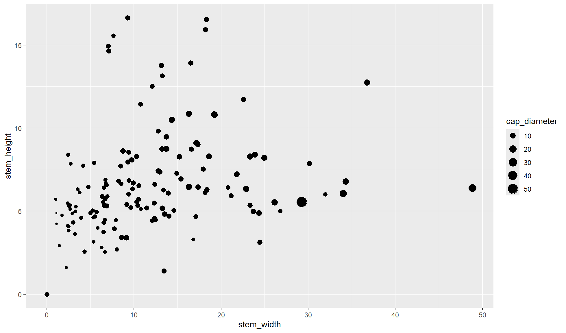
Size by continuous variable
To display a third continuous variable on a scatter plot the size of the points can be used. This can cause issues where it is more likely points will overlap due to large values producing large points.
Create a scatter plot of stem_height (y) against stem_width (x). In aes() set size=cap_diameter so the size of the points represents the cap diameter size.
mushroom_tbl |>
    ggplot2::ggplot(aes(x = stem_width, y = stem_height, size = cap_diameter)) +
    ggplot2::geom_point()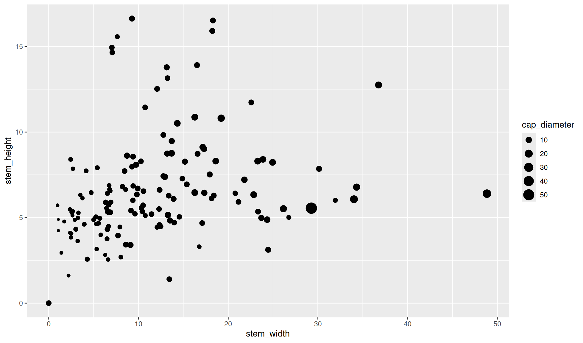
Other considerations
You may want to use a different plot or add other layers on top of a scatter plot depending on you and your data’s needs.
- A smooth line to display patterns (i.e. a linear model) can be added with
geom_smooth() - If there are too many values to effectively plot with a scatter plot you may want to use a 2D bin count plot
- Dashes can be added to the axes margins to display the distributions along with the 2d plot, this is called a rug plot