crab_age_weight_tbl <- mgrtibbles::crab_age_pred_tbl |>
    dplyr::slice(1:200) |>
dplyr::select(Weight, Age)Annotation
Text and lines can be added to a plot as a form of annotation. This page will demonstrate how to:
- Add text annotation on top of a plot
- Add multiple annotations including boxes and lines
- Add horizontal & vertical lines
- Add a diagonal abline
- Add a linear model abline with the equation
Dataset
We’ll recreate many of the plots in the basic plot chapter, so we’ll load the crab_age_pred_tbl data from the mgrtibbles package (hyperlink includes install instructions). Additionally, we’ll slice out the first 200 rows and select the columns we will utilise in the plot for a clear demonstration.
Annotation
Text annotation
Text can be placed anywhere on a plot.
To add text to a plot we can use the ggplot2::annotate() component/function with the following options:
geom=: This sets the type of geom to use for annotation- In this case it is “text” but others are demonstrated further below
x=: The x position to place the annotationy=: The y position to place the annotationlabel=: Specifies the text
ggplot2::ggplot(data=crab_age_weight_tbl, mapping=aes(x=Age, y = Weight)) +
    #Set plot as a dot/scatter plot
    ggplot2::geom_point() +
    #Add text annotation
    ggplot2::annotate(geom="text", x = 22.5, y = 50, label = "Text annotation")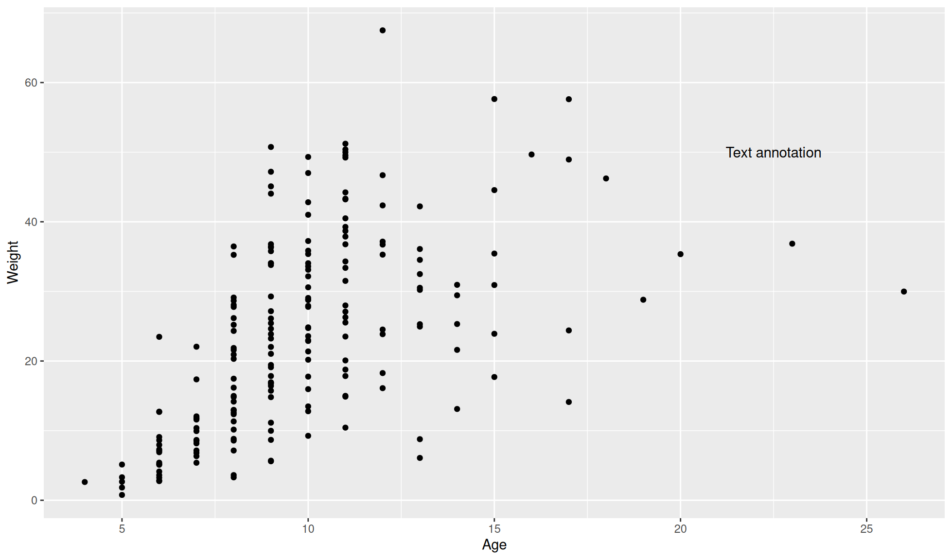
If you want to plot points as text you can look at the geom_text() function.
Multiple annotations
The below code demonstrates how to add multiple annotations and how to create rectangles (geom="rect") and lines (geom="segment").
Note: Alpha refers to the transparency of an object.
- 0 = completely transparent
- 1 = completely opaque/no transparency
ggplot2::ggplot(data=crab_age_weight_tbl, mapping=aes(x=Age, y = Weight)) +
    #Set plot as a dot/scatter plot
    ggplot2::geom_point() +
    #Add text annotation "Red lined box"
    ggplot2::annotate(geom="text", x = 10.5, y = 58, label = "Red lined box", size = 7) +
    #Add annotation "Blue box"
    ggplot2::annotate(geom="text", x = 16.5, y = 62, label = "Blue box", size = 7) +
    #Add a shaded rectangle with transparency and an outer line colour of red
    ggplot2::annotate(geom="rect", xmin = 8.5, xmax = 12.5,
                        ymin=2, ymax=55, alpha=0.2, colour="red") +
    #Add a shaded blue rectangle with transparency
    ggplot2::annotate(geom="rect", xmin = 14.5, xmax = 18.5,
                        ymin=43, ymax=60, alpha=0.2, fill="blue") +
    #Add a green line
    ggplot2::annotate("segment", x = 13, xend = 20, y = 10, yend=40, colour= "green" )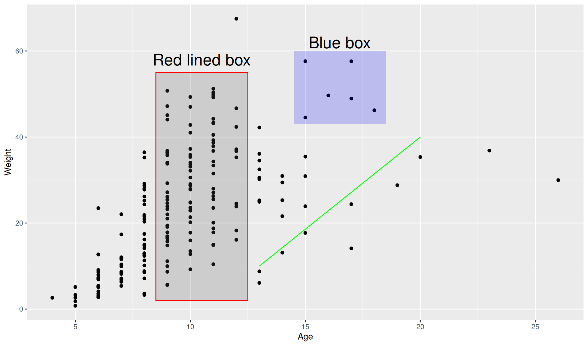
Reference lines
Three different types of reference lines can be added to a ggplot.
ggplot2::geom_abline(): A diagonal line based on the slope and interceptggplot2::geom_hline(): A horizontal line based on the y interceptggplot2::geom_vline(): A vertical line based on the x intercept
Horizontal and vertical
Vertical and horizontal lines can be added with ggplot2::geom_vline() and ggplot2::geom_hline().
The below code demonstrates adding both these lines.
ggplot2::ggplot(data=crab_age_weight_tbl, mapping=aes(x=Age, y = Weight)) +
    #Set plot as a dot/scatter plot
    ggplot2::geom_point() +
    #Vertical lines
    ggplot2::geom_vline(xintercept=15) +
    #Horizontal lines
    ggplot2::geom_hline(yintercept=20)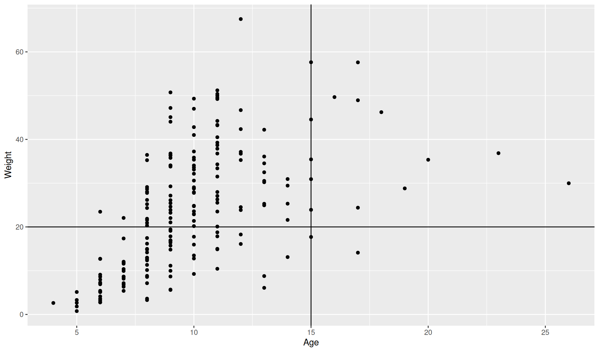
Abline
An abline is a straight diagonal line based on the intercept and slope.
Manual abline
An abline can be manually added with ggplot2::geom_abline() by setting the intercept (intercept=) and the slope (slope=).
ggplot2::ggplot(data=crab_age_weight_tbl, mapping=aes(x=Age, y = Weight)) +
    #Set plot as a dot/scatter plot
    ggplot2::geom_point() +
    #Abline
    ggplot2::geom_abline(intercept = 5, slope = 2)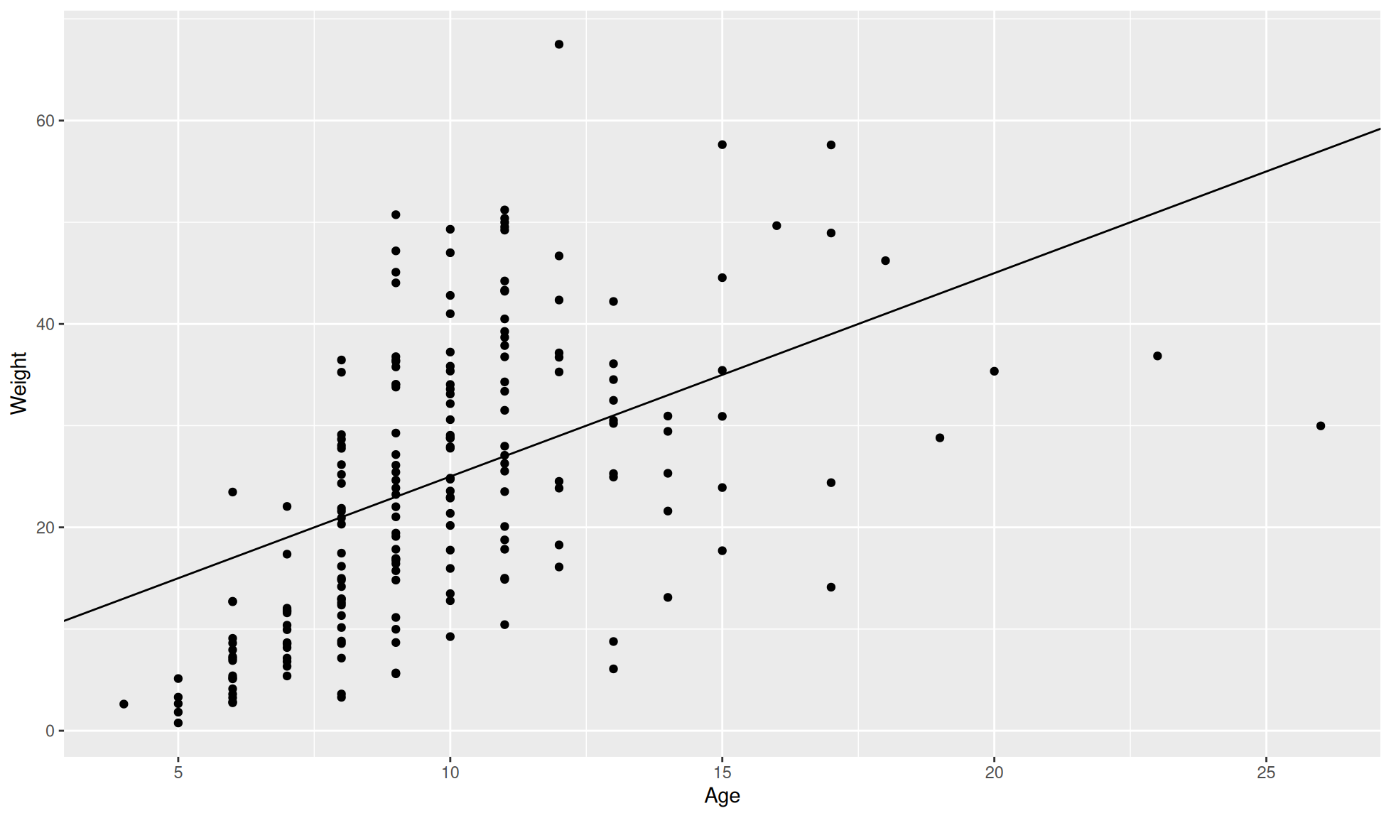
Statistical abline
An abline calculated with a linear model can be added with ggplot2::geom_smooth().
ggplot2::ggplot(data=crab_age_weight_tbl, mapping=aes(x=Age, y = Weight)) +
    #Set plot as a dot/scatter plot
    ggplot2::geom_point() +
    #Linear model abline
    ggplot2::geom_smooth(method="lm")
`geom_smooth()` using formula = 'y ~ x'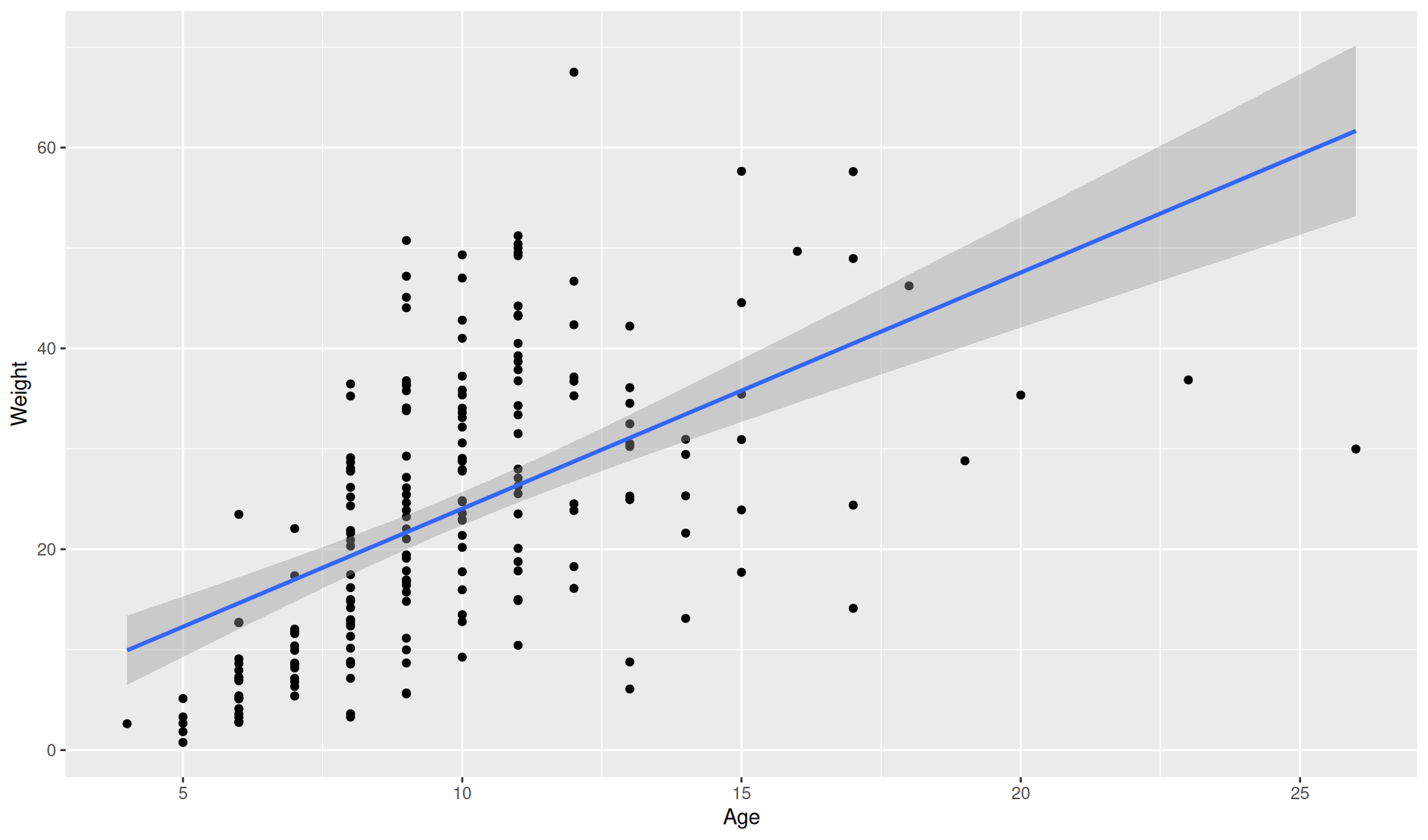
Statistical abline and equation
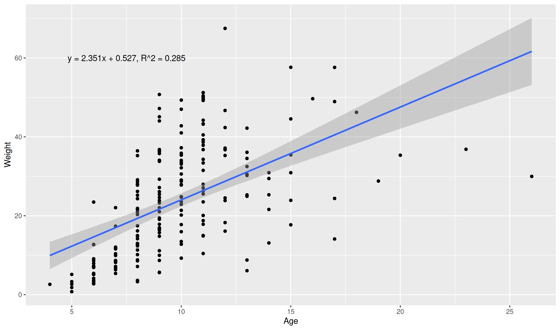
You can include the linear equation on the plot.
First we need to calculate the linear model with the base R stats package (preinstalled in R).
#Calculate and extract the slope and gradient
lm_res <- lm(Weight~Age, data = crab_age_weight_tbl)
#Intercept
c <- coef(lm_res)[[1]]
#Slope
m <- coef(lm_res)[[2]]
#R squared value
r_squared <- summary(lm_res)$adj.r.squared
#Equation
lm_equation <- stringr::str_c(
    "y = ", round(m, 3), "x + ", round(c, 3), ", R^2 = ", round(r_squared, 3))
#Print lm equation
lm_equation
[1] "y = 2.351x + 0.527, R^2 = 0.285"The equation can then be included with ggplot2::annotate().
ggplot2::ggplot(data=crab_age_weight_tbl, mapping=aes(x=Age, y = Weight)) +
    #Set plot as a dot/scatter plot
    ggplot2::geom_point() +
    #Linear model abline
    ggplot2::geom_smooth(method="lm") +
    ggplot2::annotate(geom="text", x = 7.5, y = 60, label = lm_equation)
`geom_smooth()` using formula = 'y ~ x'