#Load package
library("mgrtibbles")
#mammal_sleep_tbl tibble for demonstration
fisheries_long_tbl<- mgrtibbles::fisheries_long_tbl |>
    #Filter to only retain rows from certain countries
    # and to keep years from 2000 onwards
    dplyr::filter(Entity %in% c("European Union",  "Japan", "Peru", "United States") ,
Year >= 2000)Geom line
Line charts are commonly used to display changes of a continuous variable over another continuous variable. This can be used to great effect to see numerical changes over time.
In this page we will create line charts with ggplot2::geom_line(). Through examples we will demonstrate creating:
- A line charts with one line
- A line chart with multiple lines each representing a different group
- A stepped line chart
Dataset
For demonstration we’ll load the fisheries_long_tbl data from the mgrtibbles package (hyperlink includes install instructions). We will filter to keep only rows from EU, Japan, Peru, and USA, and the year 2000 onwards.
Single line chart
When creating a line chart only one y value can be assigned to each x value per line. To create a line chart with only one line we will plot the information for Japan.
Create a line chart of Metric_tons (y) against Year (x) for Japan. Additionally, we’ll set linewidth=1 in ggplot::geom_line() to make the line thicker for clarity.
fisheries_long_tbl |>
    #Filter to only retain Japan
    dplyr::filter(Entity=="Japan") |>
    ggplot2::ggplot(aes(x = Year, y = Metric_tons)) +
    ggplot2::geom_line(linewidth = 1)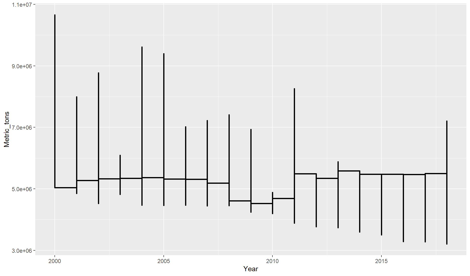
Although you can create a line chart with multiple x values per y values it becomes impossible to read fully.
The below example plots a line chart with the tibble without filtering out one Entity or colour grouping by Entity (see below). As there are four entities (EU, Japan, Peru, USA) this means there are four y values per year which are all connected before moving onto the next year.
fisheries_long_tbl |>
    ggplot2::ggplot(aes(x = Year, y = Metric_tons)) +
    ggplot2::geom_step(linewidth = 1)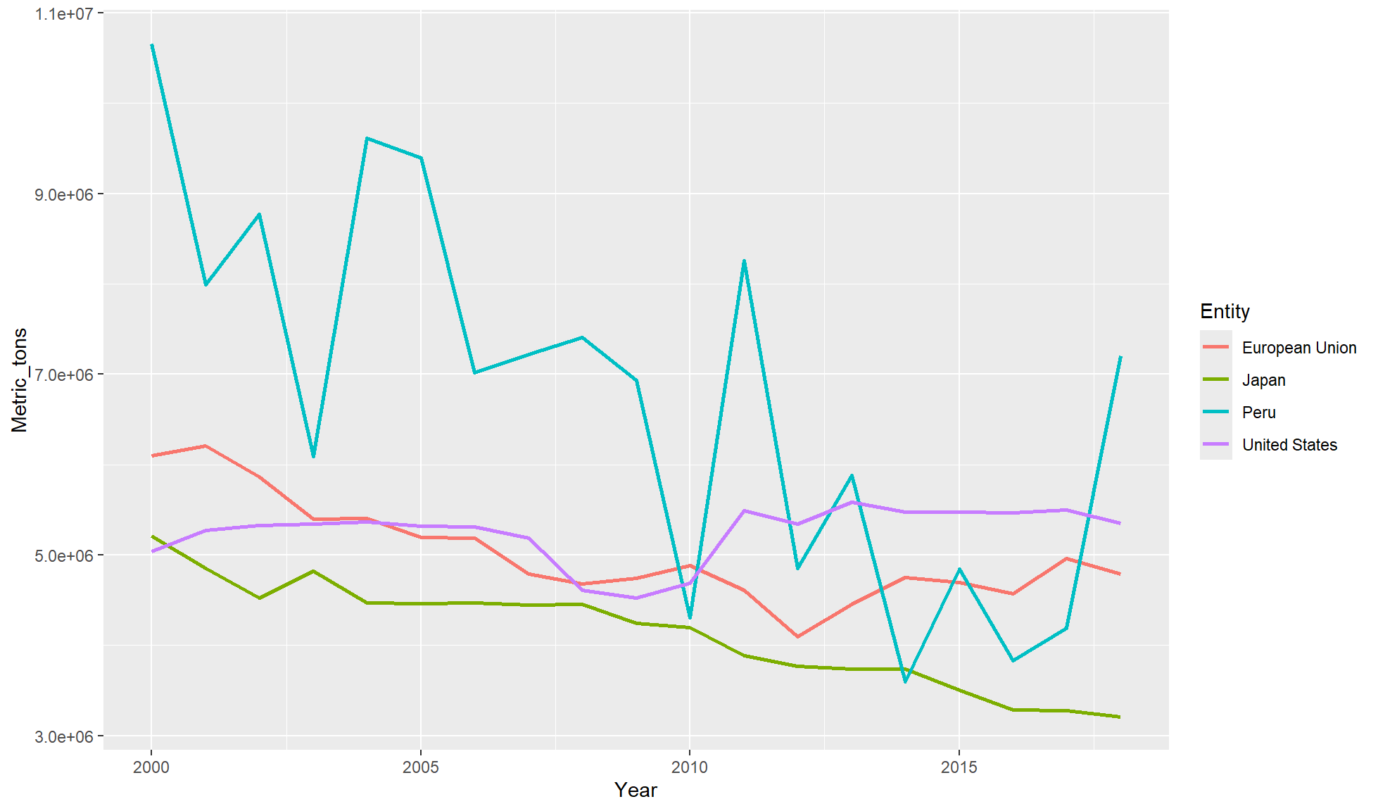
Multiple lines chart
Line charts are great for showing changes across a time range of several groups. Each group can be represented as a coloured line on the same chart.
Create a Metric_tons (y) against Year (x) line chart for our tibble. In aes() set colour=Entity so each Entity will be represented a by separate coloured line.
fisheries_long_tbl |>
    ggplot2::ggplot(aes(x = Year, y = Metric_tons, colour = Entity)) +
    ggplot2::geom_line(linewidth = 1)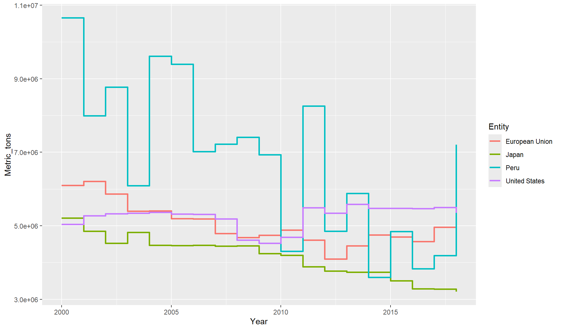
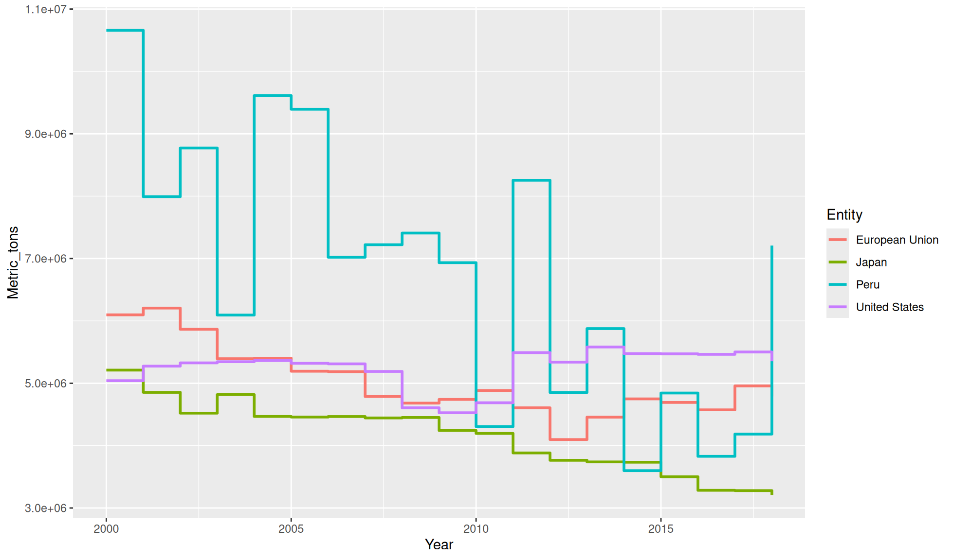
Steps
An optional method for a line chart is a stepped line chart with geom_step(). This can make it a bit easier to compare the individual values between coloured groups.
Create a Metric_tons (y) against Year (x) stepped line chart for our tibble. In aes() set colour=Entity so each Entity will be represented a by separate coloured line.
fisheries_long_tbl |>
    ggplot2::ggplot(aes(x = Year, y = Metric_tons, colour = Entity)) +
    ggplot2::geom_step(linewidth = 1)