#Load package
library("mgrtibbles")
#mushroom_tbl tibble for demonstration
mushroom_tbl <- mgrtibbles::mushroom_tblOther geoms
There are many other geom layers that can used to create different plots.
Below are a quick reference to a few of these.
For a full list please see: ggplot2 geoms list
Dataset
For demonstration we’ll load the mushroom_tbl data from the mgrtibbles package (hyperlink includes install instructions).
We’ll also make a randomly subsampled dataset for plots that are better suited to less data.
#Subsampled dataset
#Set seed for random sampling
set.seed("483")
mushroom_sample_tbl <- mushroom_tbl |>
    #Random sample of 150 rows
    dplyr::slice_sample(n = 150, replace=FALSE)
#Reset random seed to normal operation
set.seed(NULL)2D bin counts
2D bin counts add another dimension on top of a histogram. They allow you to plot the count distribution of 2 continuous variables whilst seeing the relationship between the two.
Two methods to create 2D bin counts are with:
2D bin count heatmap
Heatmap of 2D bin counts reference
mushroom_tbl |>
    ggplot2::ggplot(aes(x = stem_width, y = stem_height)) +
    ggplot2::geom_bin_2d()
`stat_bin2d()` using `bins = 30`. Pick better value `binwidth`.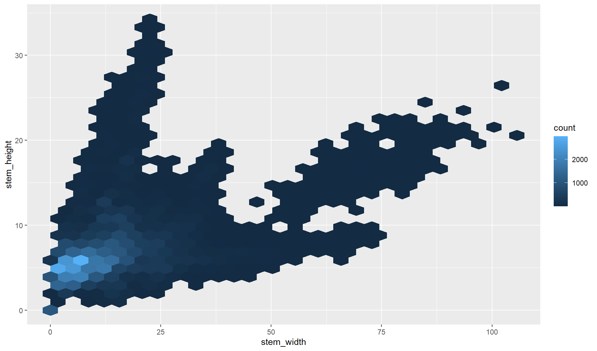
Hexagonal 2D bin count heatmap
Hexagonal heatmap of 2D bin counts reference
The function ggplot2::geom_hex() requires the hexbin package to be installed.
#Install hexbin if not already installed
if (!require("hexbin")) install.packages("hexbin")
Loading required package: hexbinlibrary("hexbin")Generally hex bin heatmaps are better than square based 2D bin count heatmaps (above) as the regular square tiles can cause unwanted artifacts.
mushroom_tbl |>
    ggplot2::ggplot(aes(x = stem_width, y = stem_height)) +
    ggplot2::geom_hex()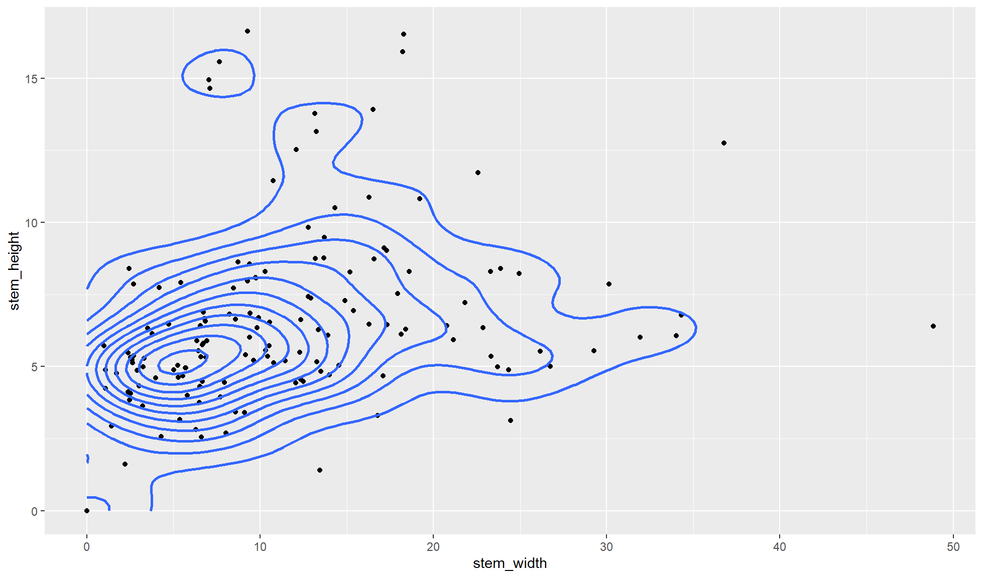
Smooth density plot
A smooth density plot is like a histogram but instead of bars the count distribution of one continuous variable is displayed as a smooth line graph. The main advantage of a density plot over a histogram is that you can easily visualise the distribution shape as it does not rely on choosing the bin sizes or number of bins.
mushroom_tbl |>
    ggplot2::ggplot(aes(x = cap_diameter)) +
    ggplot2::geom_density(linewidth=1)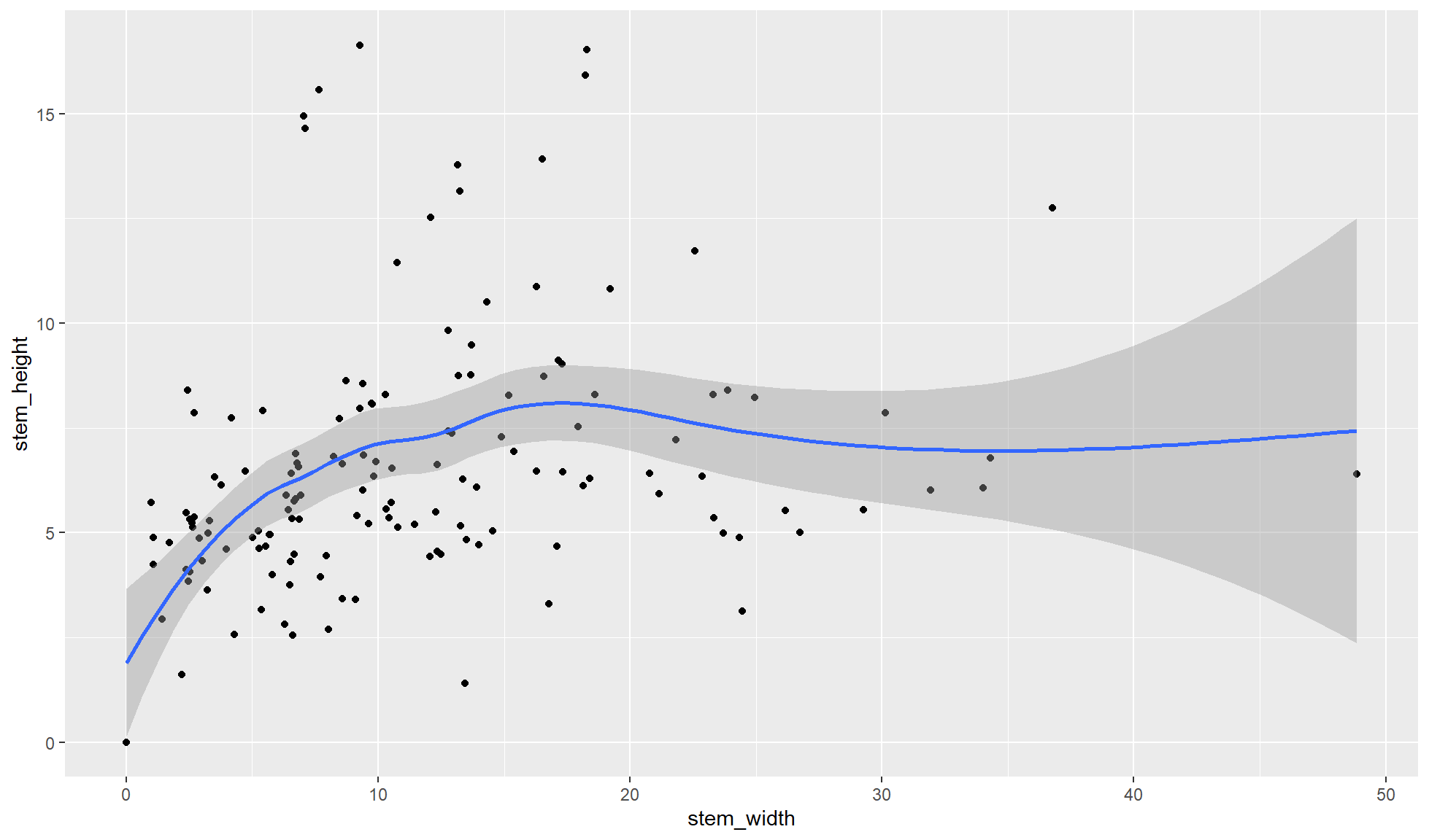
Scatter plot additional layers
Geom layers can be added on top of a main geom layer (e.g. box plot, histogram, scatter plot etc.). Three different layers that can be used with scatter plots (geom_point()) are shown below.
- 2D density plots with
geom_density_2d() - Smooth line scatter plot with
geom_smooth() - Rug plot with
geom_rug()
2D density plot
A 2D density plot is a scatter plot with added density lines. These density lines look similar to the contour lines of a geographical map. The closer the lines are together the higher the density of points. Additionally, the shape of the lines can help display patterns in the data.
#Smooth density plot
#Use subsampled tibble
mushroom_sample_tbl |>
    #ggplot code
    ggplot2::ggplot(aes(x = stem_width, y = stem_height)) +
    ggplot2::geom_point() +
    ggplot2::geom_density_2d(linewidth=1)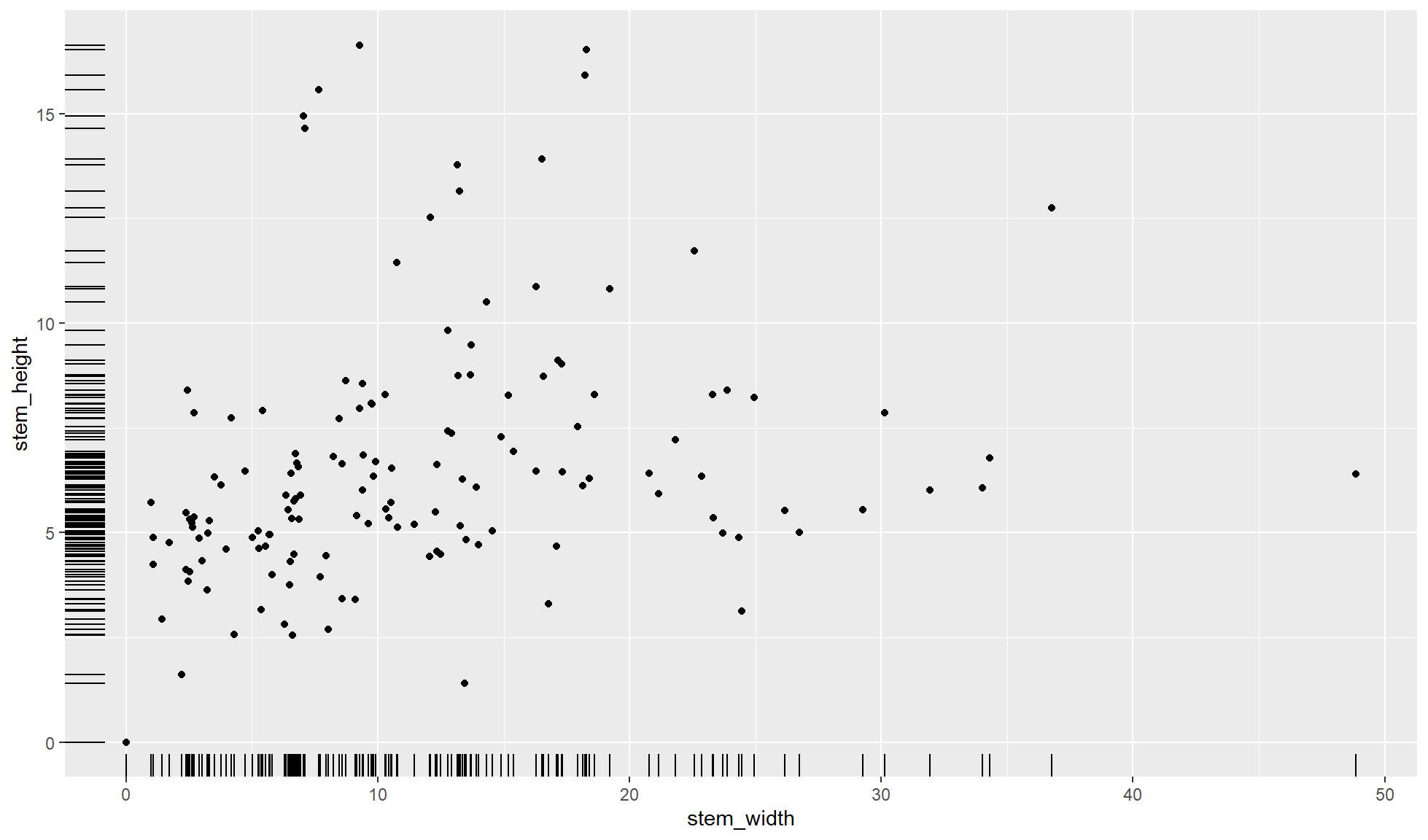
Smooth line
A smooth line can be added to view patterns in a scatter plot. By default the smoothing method will be automatically chosen based on the data but it can be set to other methods including “lm” or “glm”. The below plot automatically uses “loess”.
#Scatter plot with smooth line
#Use subsampled tibble
mushroom_sample_tbl |>
    #ggplot code
    ggplot2::ggplot(aes(x = stem_width, y = stem_height)) +
    ggplot2::geom_point() +
    ggplot2::geom_smooth()
`geom_smooth()` using method = 'loess' and formula = 'y ~ x'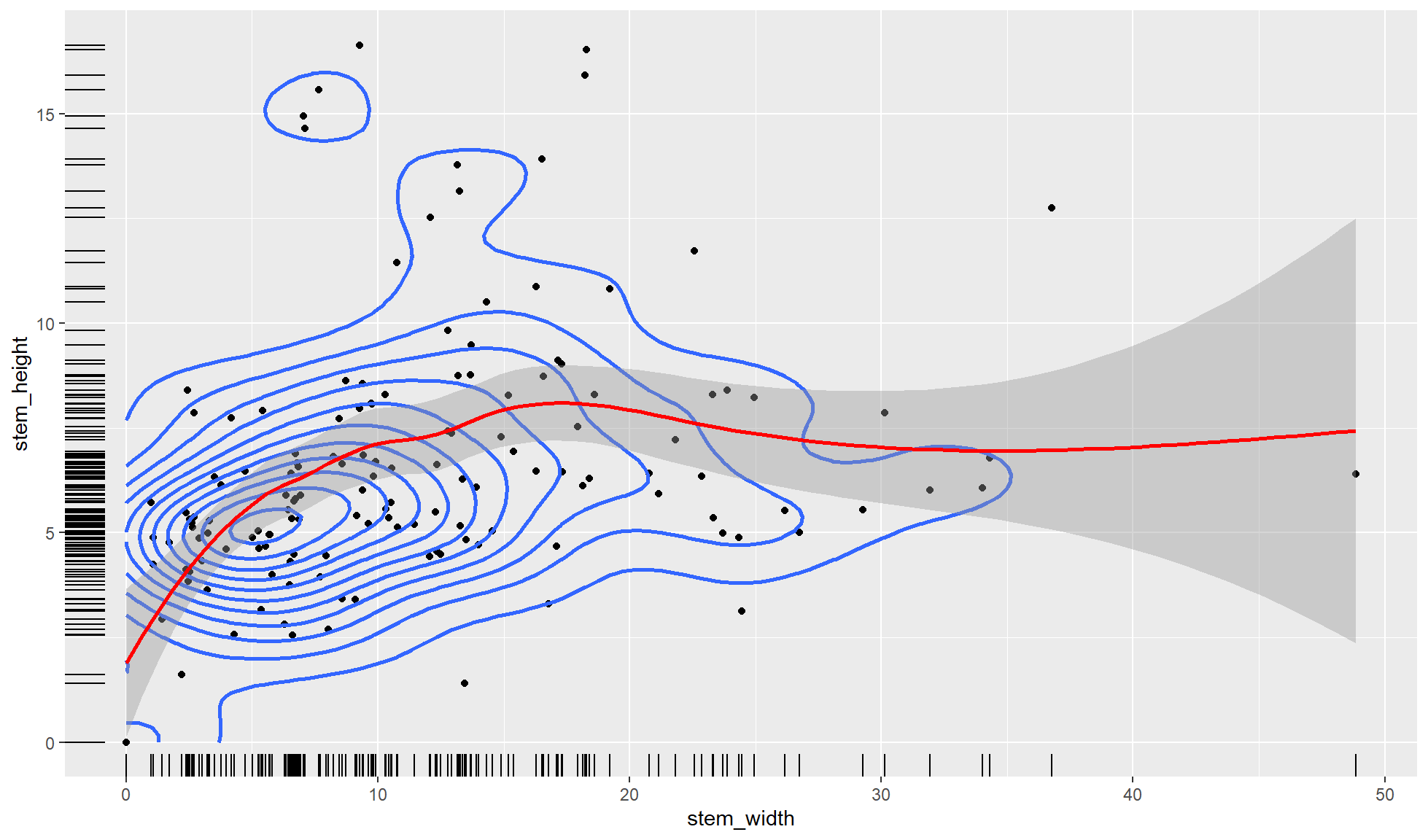
Rug
A rug plot is an addition to a scatter plot. The rug plot displays the the distribution of points on the x and y margins. Each point is represented by a tick on the x and y axis locations and is therefore best used with a smaller dataset.
#Scatter plot with rug plot
#Use subsampled tibble
mushroom_sample_tbl |>
    #ggplot code
    ggplot2::ggplot(aes(x = stem_width, y = stem_height)) +
    ggplot2::geom_point() +
    ggplot2::geom_rug()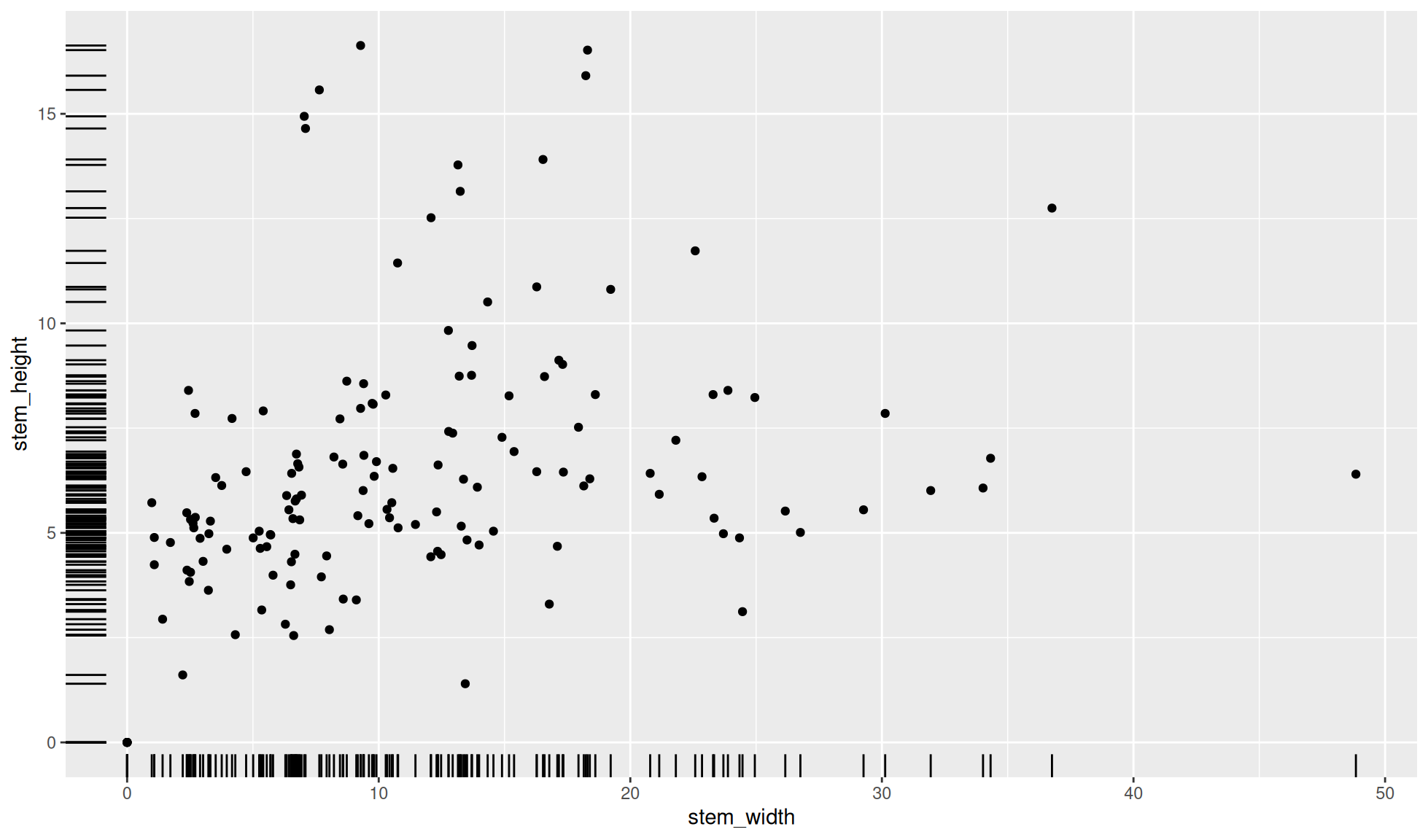
Multiple layers
Of course more than one additional layer can be added to a plot if appropriate. Below the code and image of a scatter plot with 2D density contours, a smooth line, and a rug plot is shown.
#Multple layed scatter plot
#Use subsampled tibble
mushroom_sample_tbl |>
    #ggplot code
    ggplot2::ggplot(aes(x = stem_width, y = stem_height)) +
    ggplot2::geom_point() +
    ggplot2::geom_density_2d(linewidth=1) +
    ggplot2::geom_smooth(colour = "red") +
    ggplot2::geom_rug()
`geom_smooth()` using method = 'loess' and formula = 'y ~ x'
Others
There are even more geoms that can used. For a full list please see: ggplot2 geoms list