#Load package
library("mgrtibbles")
#bat_roost_tbl tibble for demonstration
bat_roost_tbl <- mgrtibbles::bat_roost_tbl |>
    #Select all but roost code column
    dplyr::select(!RoostCode) |>
    #Filter out rows with a MaxCountInAnyYear greater than or equal to 250
    # and remove observations from "British Crown Dependencies"
    dplyr::filter(MaxCountInAnyYear < 250 & Country != "British Crown Dependencies") |>
    #Remove rows where Country or Species is NA
tidyr::drop_na(c("Country","Species"))Geom boxplot
Box plots can display the distribution of a single continuos variable. It can be particularly useful with large amounts of data where other plots cannot effectively display all the values.
In this page we will create scatter plots with ggplot2::geom_boxplot(). Through examples we will demonstrate creating:
- A default box plot
- A box plot split by a categorical variable
- A flipped box plot
- A box plot with a layer of jittered points
- A violin plot with jittered points
Dataset
For demonstration we’ll load the bat_roost_tbl data from the mgrtibbles package (hyperlink includes install instructions). To preprocess the data we will:
- Remove the
RoostCodevariable/column withdplyr::select - Remove rows/observations with a
MaxCountInAnyYeargreater than or equal to 250 withdplyr::filter() - Remove rows/observations from the
Countrygrouping “British Crown Dependencies” to retain the countries England, Northern Ireland, Scotland, and Wales withdplyr::filter() - Remove rows/observations where the the
CountryorSpeciesvalue isNAwithtidyr:drop_na()
Default box plot
Create a box plot of the MaxCountInAnyYear (y axis). This will show the distribution of the max yearly population count within each of the tracked roosts in the UK.
bat_roost_tbl |>
    ggplot2::ggplot(aes(y = MaxCountInAnyYear)) +
    ggplot2::geom_boxplot()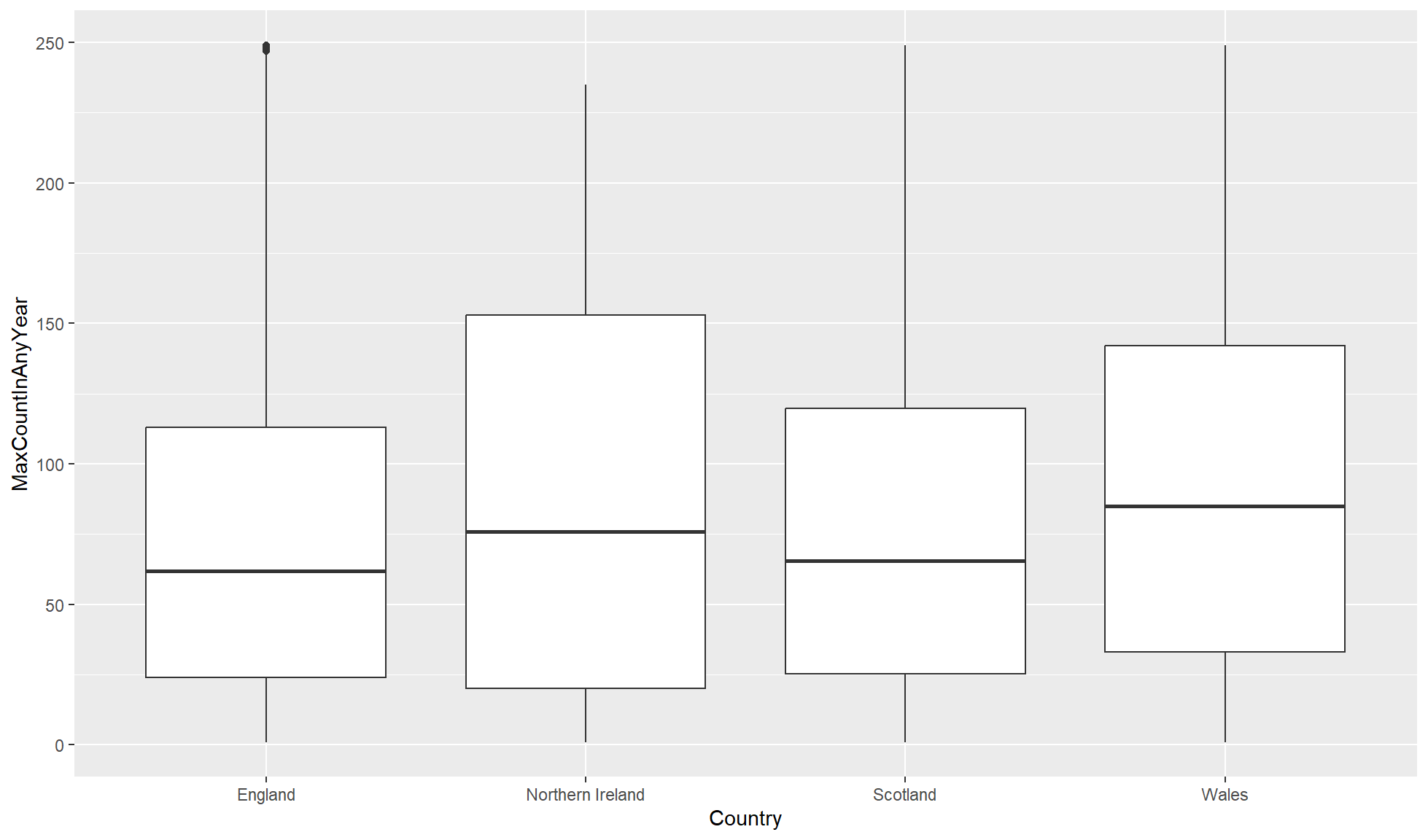
Split by categorical variable
Box plots become very powerful when comparing distributions of the same continuous variable across different categorical variables.
Create a box plot of MaxCountInAnyYear (y) against the categorical variable Country (x). In aes() set x=Country so there is a box and whisker for each Country, separated on the x-axis.
bat_roost_tbl |>
    #Box plot
    ggplot2::ggplot(aes(y = MaxCountInAnyYear, x = Country)) +
    ggplot2::geom_boxplot()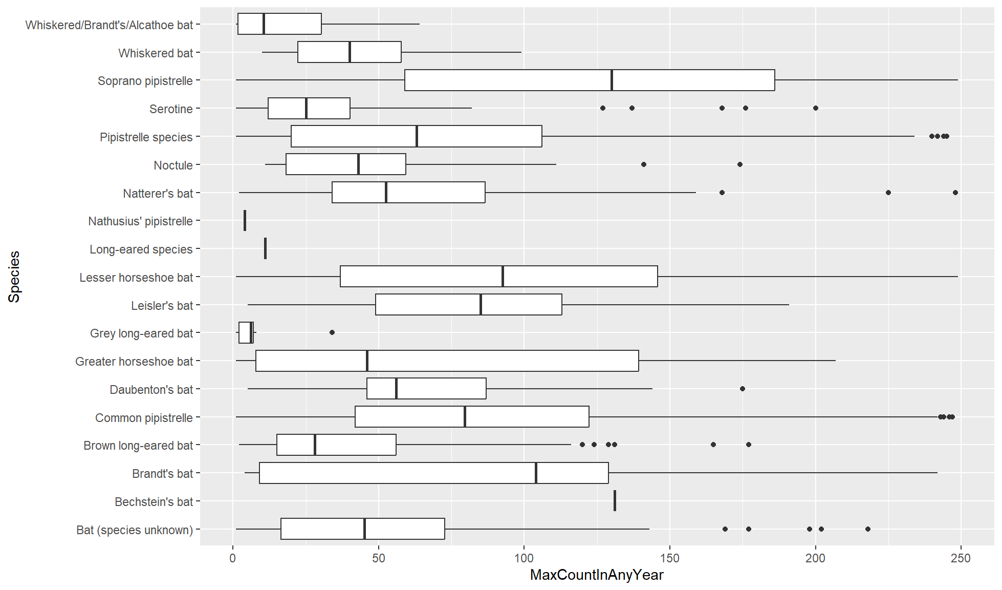
Flipped box plot
If the categorical variable has a lot of groups, long names, or both, you can create a flipped box plot.
Create a box plot of the numerical variable MaxCountInAnyYear on the x-axis against the categorical variable Species on the y-axis. In aes() set y=Species and x=MaxCountInAnyYear so there is a box and whisker for each Species, separated up on the y-axis.
bat_roost_tbl |>
    #Box plot
    ggplot2::ggplot(aes(x = MaxCountInAnyYear, y = Species)) +
    ggplot2::geom_boxplot()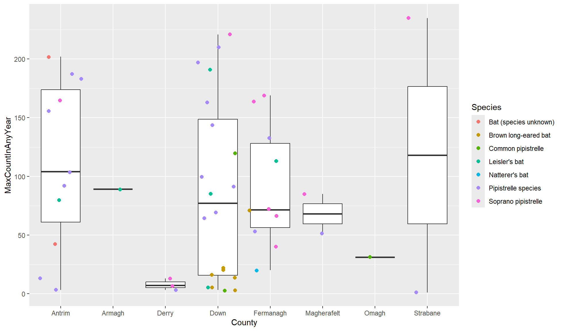
Layer of jittered points
You can add points on top of a box plot to visualise the individual values. We can add these points with ggplot2::geom_jitter() which will cause the points to “jitter”. The points will be randomly distributed across the x axis if mapped to the y axis and vice versa. This is useful so points are less likely to overlap.
Adding points allows us to add a second categorical variable that we can colour the points with.
Create a box plot of MaxCountInAnyYear (y) against the County (x) of Northern Ireland observations/rows.
To the box plot add the layer ggplot2::geom_jitter(). In the function add aes(colour_species) so the points, and not the box and whiskers, are coloured by species. Additionally, set size=2 in ggplot2::geom_jitter() but outside of its aes() to make the points larger.
#Boxplot of max population count in bat colonies within counties of Northern Ireland
bat_roost_tbl |>
    #Filter to only retain Northern Ireland rows
    dplyr::filter(Country == "Northern Ireland") |>
    #Box plot
    ggplot2::ggplot(aes(y = MaxCountInAnyYear, x = County)) +
    ggplot2::geom_boxplot() +
    ggplot2::geom_jitter(aes(colour=Species), size=2)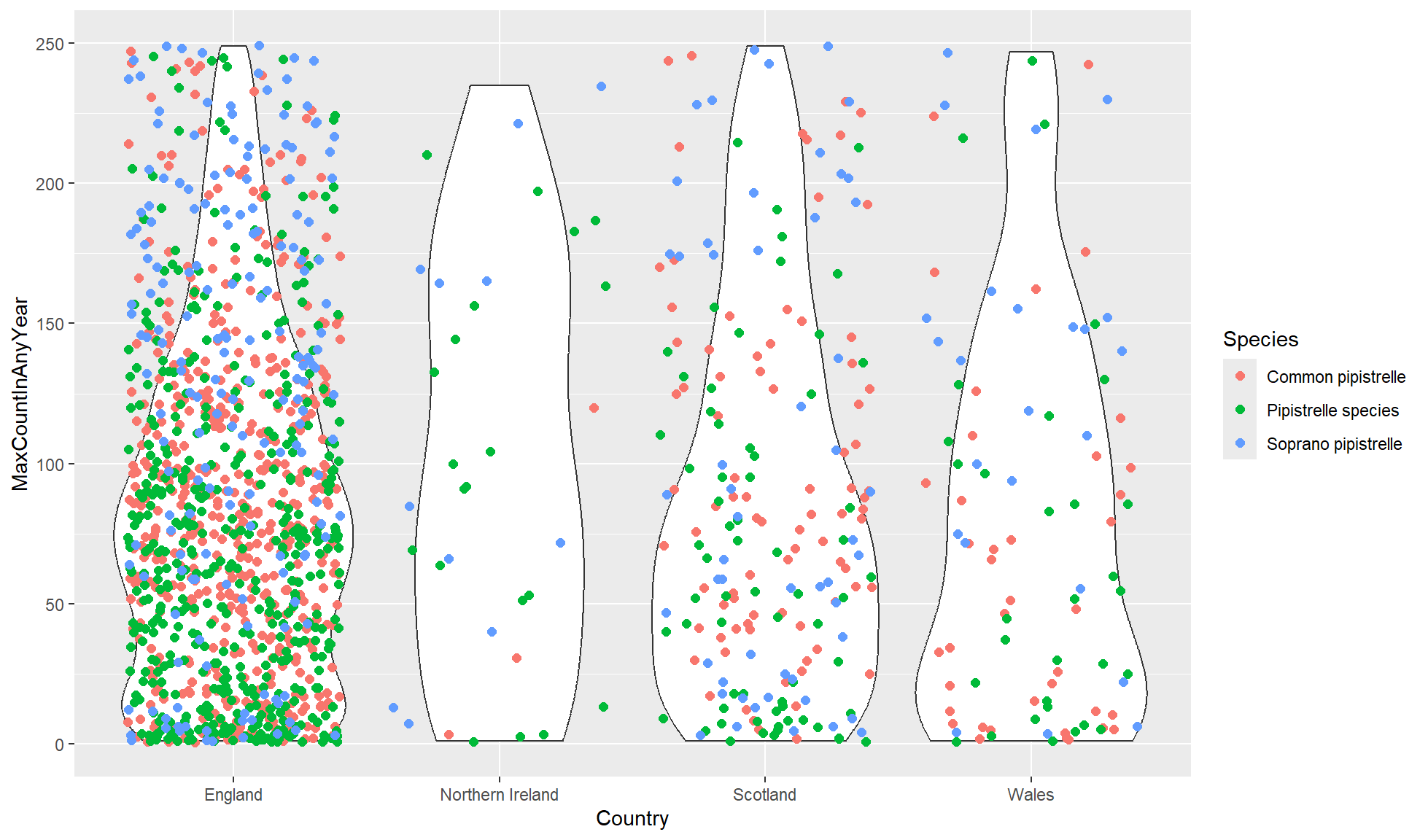
Violin plot
Violin plots are very similar to box plots but they display the probability density across the values. This can be more appropriate to datasets that do not follow bell curve/normal distributions. In fact, some people prefer using violin plots to box plots, myself included.
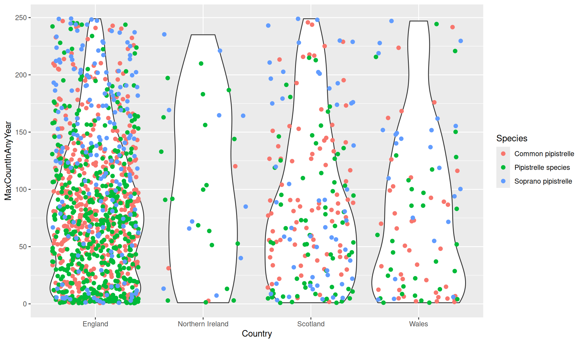
We will create a violin plot with jittered points of the different Pipistrelle species across the four countries.
Create a violin plot of MaxCountInAnyYear (y) against Country (x). Add a layer of jittered points coloured by Species.
#Violin plot of max population count of Pipistrelle colonies in the UK countries
bat_roost_tbl |>
    #Filter to only retain Pipistrelle species
    dplyr::filter(Species %in% c("Common pipistrelle", "Pipistrelle species",
                                    "Soprano pipistrelle")) |>
    #Box plot
    ggplot2::ggplot(aes(y = MaxCountInAnyYear, x = Country)) +
    ggplot2::geom_violin() +
    ggplot2::geom_jitter(aes(colour=Species), size=2)