#Load package
library("mgrtibbles")
#bat_roost_tbl tibble for demonstration
bat_roost_tbl <- mgrtibbles::bat_roost_tbl |>
    #Select all but roost code column
    dplyr::select(!RoostCode) |>
    #Filter out rows with a MaxCountInAnyYear greater than or equal to 250
    # and remove observations from "British Crown Dependencies"
    dplyr::filter(MaxCountInAnyYear < 250 & Country != "British Crown Dependencies") |>
    #Remove rows where Country or Species is NA
tidyr::drop_na(c("Country","Species"))Guides
The guides of legends and axes values can be customised to make the data clearer. This can be carried out with the functions/components:
ggplot2::legend_guide(): Change the position of the title and change the number of rows/columns the values are placed withinggplot2::guide_axis(): Allow the axis values to dodge each other or change their angle
When using these functions we place them within the ggplot2::guide() function/component so we can set the aesthetic we specifically want to change. This will be demonstrated below.
Dataset
We’ll recreate many of the plots in the geom_boxplot() chapter, so we’ll load the bat_roost_tbl data from the mgrtibbles package (hyperlink includes install instructions). To preprocess the data we will:
- Remove the
RoostCodevariable/column withdplyr::select - Remove rows/observations with a
MaxCountInAnyYeargreater than or equal to 250 withdplyr::filter() - Remove rows/observations from the
Countrygrouping “British Crown Dependencies” to retain the countries England, Northern Ireland, Scotland, and Wales withdplyr::filter() - Remove rows/observations where the the
CountryorSpeciesvalue isNAwithtidyr:drop_na()
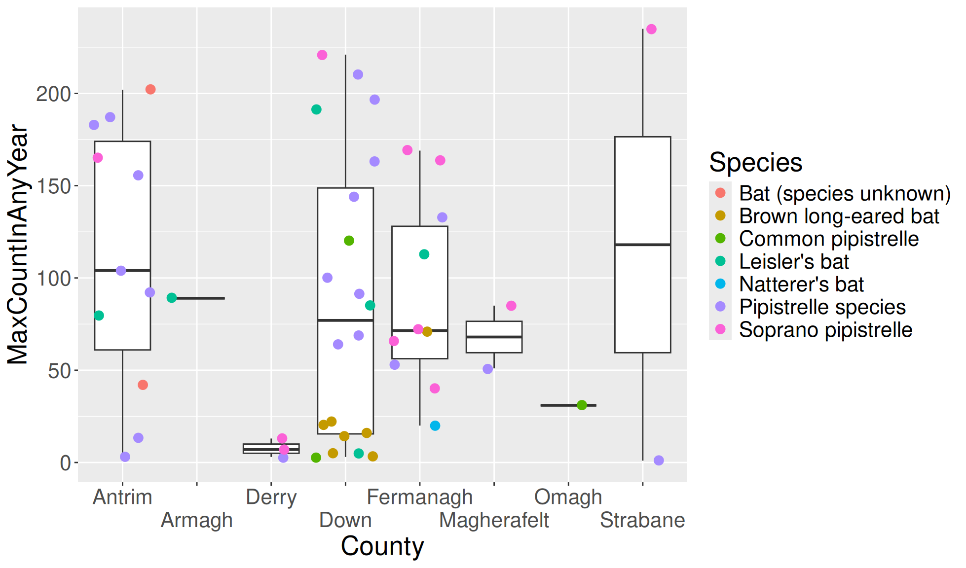
Legend guide column numbers
The number of columns to display the legend values can be set. This is useful when you have a large amount of values to display or you are setting the legend below the plot.
Create the boxplot with a layer of jittered points. We’ll cause the colour legend values to be spread over 2 columns with:
ggplot2::guides(col = guide_legend(ncol = 2))
#Boxplot of max population count in bat colonies within counties of Northern Ireland
bat_roost_tbl |>
    #Filter to only retain Northern Ireland rows
    dplyr::filter(Country == "Northern Ireland") |>
    #Box plot
    ggplot2::ggplot(aes(y = MaxCountInAnyYear, x = County)) +
    ggplot2::geom_boxplot() +
    ggplot2::geom_jitter(aes(colour=Species), size=3) +
    #Colour legend values over 2 columns
    ggplot2::guides(col = guide_legend(ncol = 2))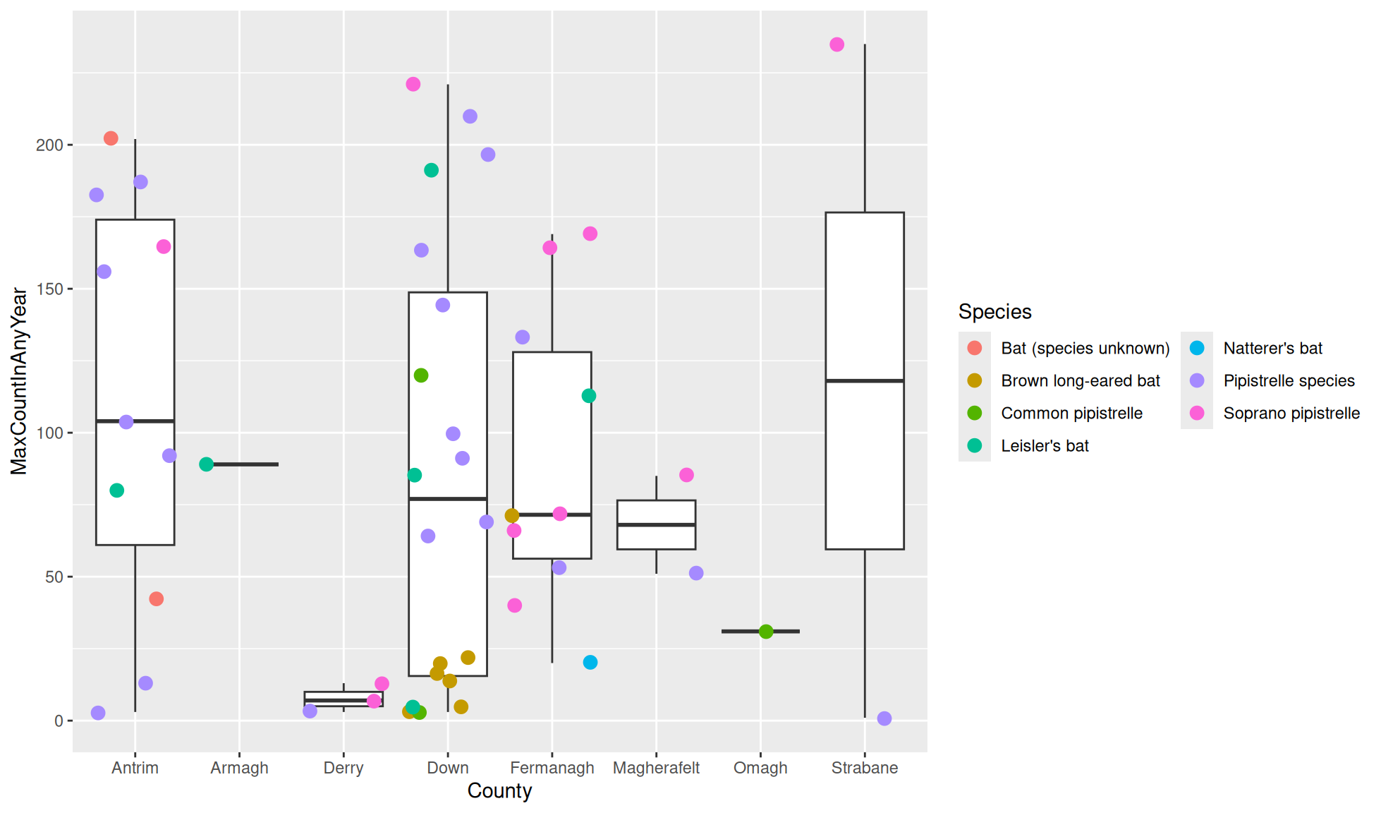
Axis guides dodging
The axis guides can be used to angle the values or cause them to dodge each other. We showed how to angle them in the theme page (there are multiple ways to do some of the same things in ggplot2). We will therefore only demonstrate how to allow axis labels to dodge each other.
Create the boxplot with a layer of jittered points. We’ll carry out the following changes:
- Set all the text size to 20 (Set all text size with
ggplot2::theme()) - Set the x axis text to dodge with
ggplot2::guide(x = ggplot2::guide_axis(n.dodge = 2))- The 2 represents the number of rows/columns used for dodging.
#Boxplot of max population count in bat colonies within counties of Northern Ireland
bat_roost_tbl |>
    #Filter to only retain Northern Ireland rows
    dplyr::filter(Country == "Northern Ireland") |>
    #Box plot
    ggplot2::ggplot(aes(y = MaxCountInAnyYear, x = County)) +
    ggplot2::geom_boxplot() +
    ggplot2::geom_jitter(aes(colour=Species), size=3) +
    #Theme to increase all text size
    ggplot2::theme(text=ggplot2::element_text(size=20)) +
    #Guide for x axis guides dodge
    ggplot2::guides(x = ggplot2::guide_axis(n.dodge = 2))