#Load package
library("mgrtibbles")
#mammal_sleep_tbl tibble for demonstration
mammal_sleep_tbl<- mgrtibbles::mammal_sleep_tbl |>
    dplyr::select("total_sleep","danger") |>
    #Remove rows with NA values
    tidyr::drop_na() |>
    #Reorder danger factor levels
mutate(danger = forcats::fct_relevel(danger, "1","2","3","4","5"))Geom histogram
Histograms are commonly used to display the distribution of a single continuous variable. This is carried out by creating bins (i.e. number ranges) and counting the number of values that are within each bin. These bin counts are displayed as a bar chart.
In this page we will create histograms with ggplot2::geom_histogram(). Through examples we will demonstrate creating:
- A histogram with default options
- A histogram when specifying bin width
- A histogram when specifying the number of bins
- A flipped histogram
- A frequency polygon
Dataset
For demonstration we’ll load the mammal_sleep_tbl data from the mgrtibbles package (hyperlink includes install instructions). We will select the total_sleep and predation columns for our plots.
Default histogram
When creating a histogram with geom_histogram() a continuous numerical variable/column can be mapped to the x aesthetic. The function will create bins (number ranges) and count the number of values that fit within each bin.
For our default histogram the data will be fit into 30 bins. This is always the default value of ggplot2::geom_histogram() and the function will output a message saying how to choose a better value. However, the best method on choosing a value is to create the default plot first and then experiment with bin numbers afterwards. Choosing bin widths or bin numbers is shown below.
Create a histogram of the total_sleep variable/column. This is a column of continuous doubles <dbl> representing the total hours of sleep per day for different mammals.
mammal_sleep_tbl |>
    ggplot2::ggplot(aes(x = total_sleep)) +
    ggplot2::geom_histogram()
`stat_bin()` using `bins = 30`. Pick better value `binwidth`.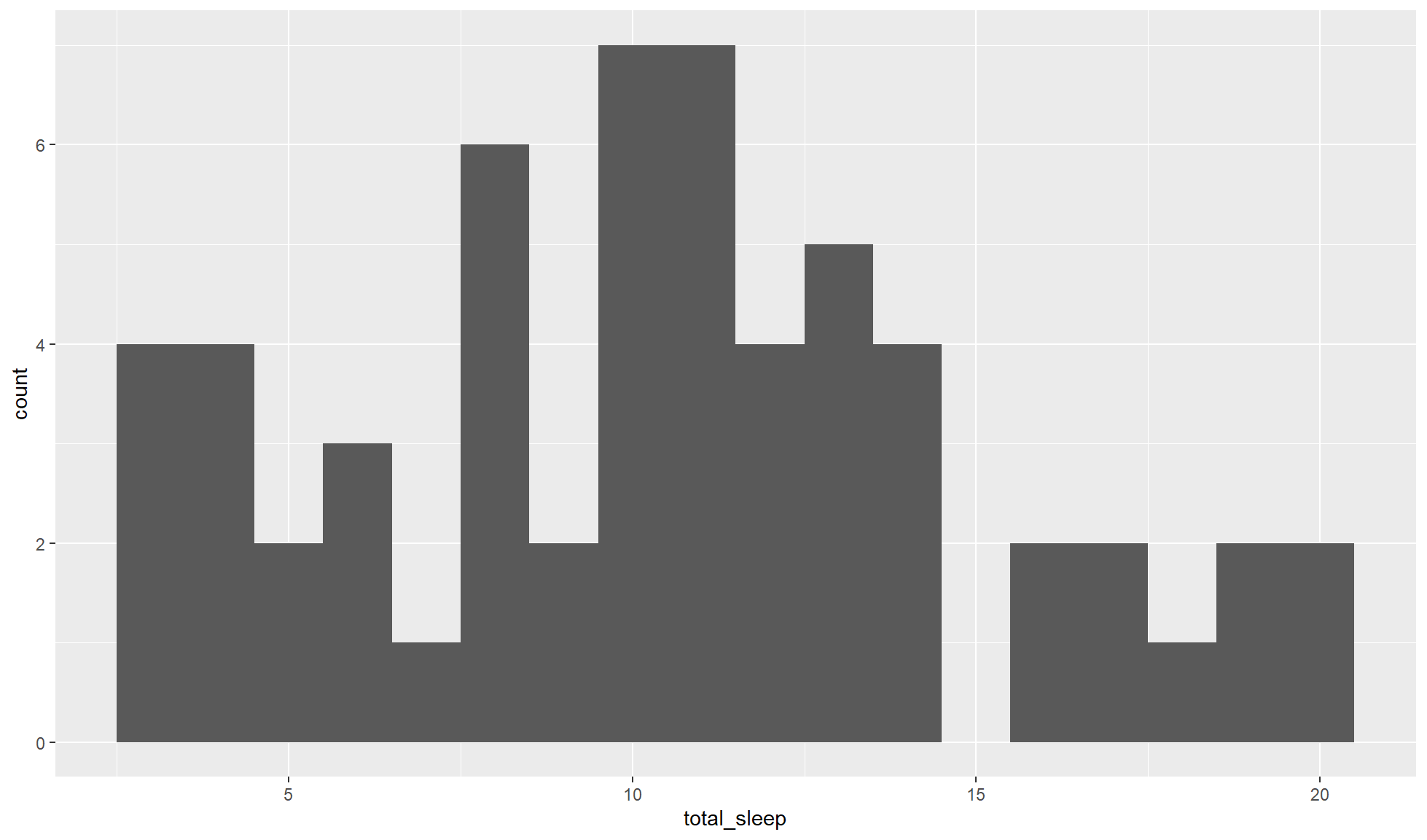
Bin width
The default number of bins for ggplot2::geom_histogram() is rarely going to be the best option. To choose the bin width (i.e. the number range of the bins) we can use the option binwidth=.
Create a histogram of total_sleep with a bin size of 1 hour (i.e. 1).
mammal_sleep_tbl |>
    ggplot2::ggplot(aes(x = total_sleep)) +
    ggplot2::geom_histogram(binwidth = 1)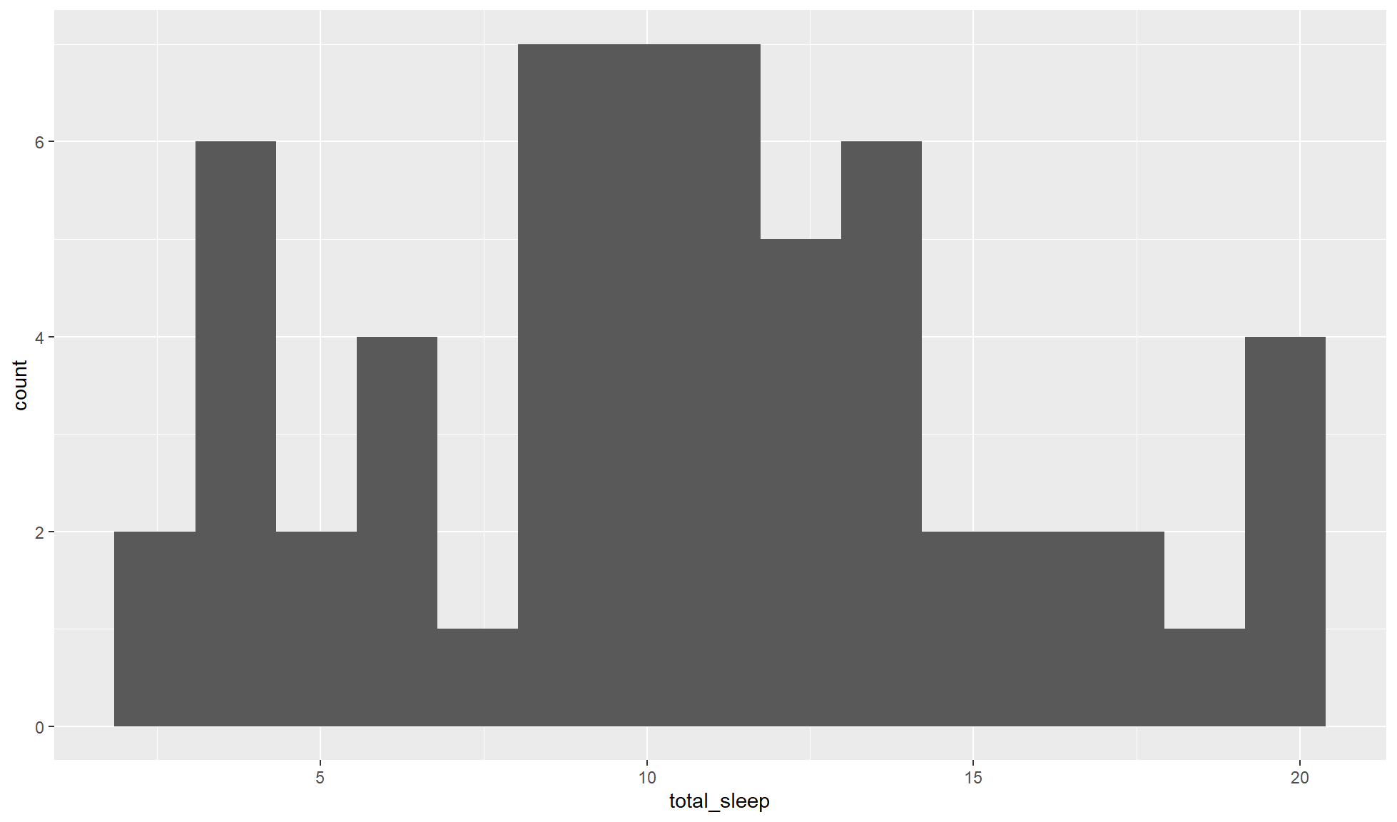
Amount of bins
The amount of bins to fit the data into can be set with the option bins=.
Create a histogram of total_sleep with a total of 15 bins.
mammal_sleep_tbl |>
    ggplot2::ggplot(aes(x = total_sleep)) +
    ggplot2::geom_histogram(bins = 15)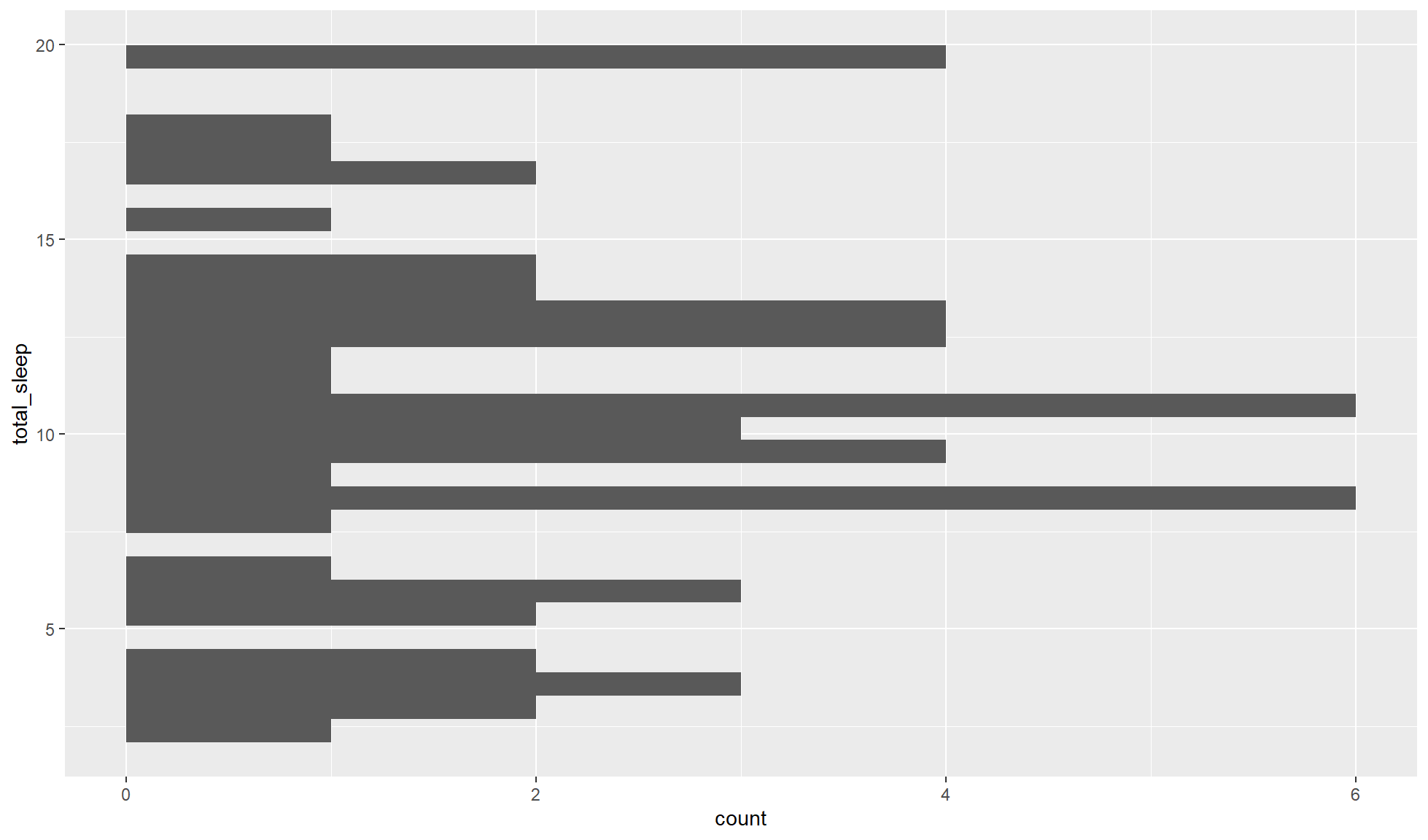
Flipped histogram
To create a flipped histogram you can map the continuous variable to the y aesthetic.
Create a flipped histogram of the total_sleep continuous double variable/column.
mammal_sleep_tbl |>
    ggplot2::ggplot(aes(y = total_sleep)) +
    ggplot2::geom_histogram()
`stat_bin()` using `bins = 30`. Pick better value `binwidth`.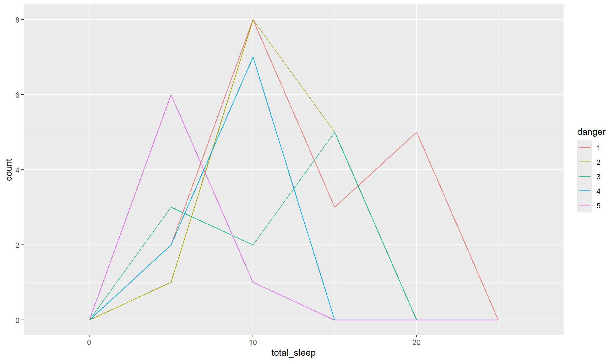
Frequency polygon
Histograms are great if you are only looking at one group but not as suitable for looking at distributions between groups. Instead you can create a frequency polygon with ggplot2::geom_freqpoly(). A frequency polygon shows the same information as a histogram but uses lines instead of bars.
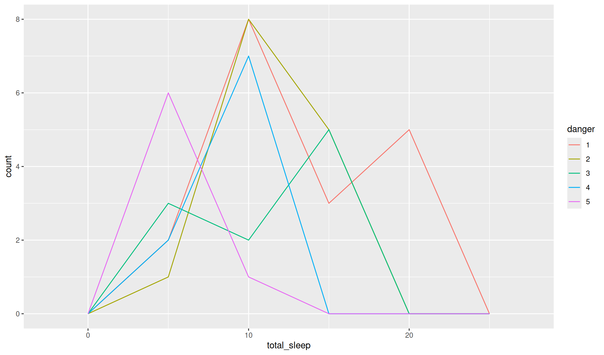
Create a frequency polygon of total__sleep separated by the danger levels of the mammals (1 = least danger from other animals, 5 = most danger from other animals).
mammal_sleep_tbl |>
    ggplot2::ggplot(aes(x = total_sleep, colour = danger)) +
    ggplot2::geom_freqpoly(binwidth = 5)