#Load package
library("mgrtibbles")
#bat_roost_tbl tibble for demonstration
bat_roost_tbl <- mgrtibbles::bat_roost_tbl |>
    #Select all but roost code column
    dplyr::select(!RoostCode) |>
    #Filter out rows with a MaxCountInAnyYear greater than or equal to 250
    # and remove observations from "British Crown Dependencies"
    dplyr::filter(MaxCountInAnyYear < 250 & Country != "British Crown Dependencies") |>
    #Remove rows where Country or Species is NA
tidyr::drop_na(c("Country","Species"))Colour scales
The default colours used for ggplot2 are suitable for small amounts of groups but they can be improved. In this page we will demonstrate how to change the colour scale of the colour aesthetic with:
ggplot2::scale_colour_brewer(): Change the colours used to the colour brewer paletteggplot2::scale_colour_manual(): Set the colours to be used manually- Allows the use of colour blind friendly palettes
Additionally, you can change the colour scale of the fill aesthetic with:
ggplot2::scale_fill_brewer(): Change the colours used by the fill aesthetic to the colour brewer paletteggplot2::scale_fill_manual(): Set the colours of the fill aesthetic to be used manually- Allows the use of colour blind friendly palettes
There are many other ways to change the colour scale. Please see the below link for the full list of functions.
Dataset
We’ll recreate many of the plots in the geom_boxplot() chapter, so we’ll load the bat_roost_tbl data from the mgrtibbles package (hyperlink includes install instructions). To preprocess the data we will:
- Remove the
RoostCodevariable/column withdplyr::select - Remove rows/observations with a
MaxCountInAnyYeargreater than or equal to 250 withdplyr::filter() - Remove rows/observations from the
Countrygrouping “British Crown Dependencies” to retain the countries England, Northern Ireland, Scotland, and Wales withdplyr::filter() - Remove rows/observations where the the
CountryorSpeciesvalue isNAwithtidyr:drop_na()
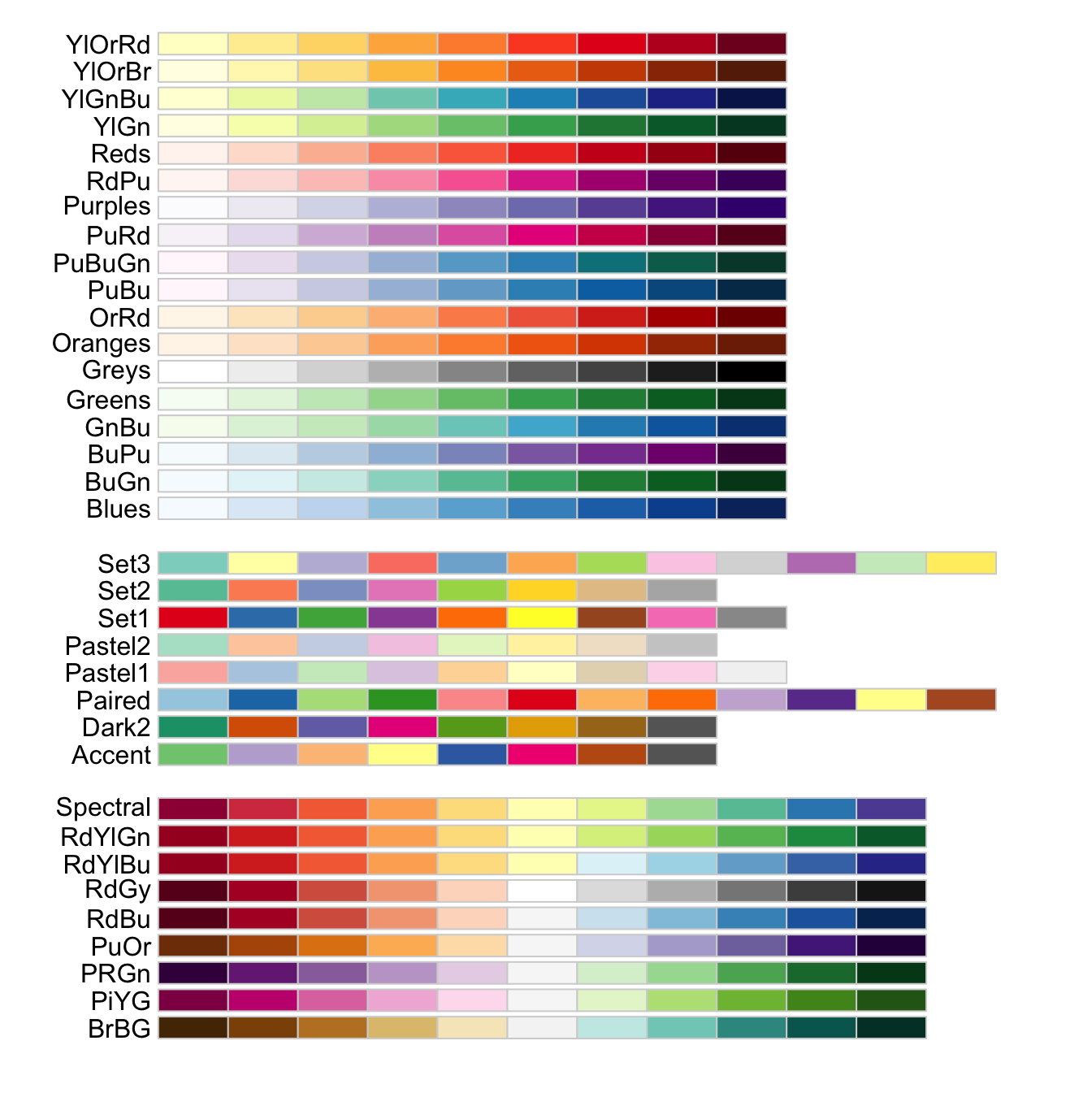
Colour brewer
Colour brewer is a popular set of palettes used for maps and other data visualisation plots. Its colours can be used in a ggplot with the function/component ggplot2::scale_colour_brewer().
Colour brewer palettes
The full set of colour brewer palettes can be seen below.
Colour brewer plot
Create the boxplot with a layer of jittered points. We’ll colour the points with Colour brewer set 2 using the component scale_colour_brewer(). As an option we provide palette= with the name of the palette matching that in the above image of palettes.
scale_colour_brewer() web page
#Boxplot of max population count in bat colonies within counties of Northern Ireland
bat_roost_tbl |>
    #Filter to only retain Northern Ireland rows
    dplyr::filter(Country == "Northern Ireland") |>
    #Box plot
    ggplot2::ggplot(aes(y = MaxCountInAnyYear, x = County)) +
    ggplot2::geom_boxplot() +
    ggplot2::geom_jitter(aes(colour=Species), size=3) +
    #Colour brewer scale
    ggplot2::scale_colour_brewer(palette = "Set2")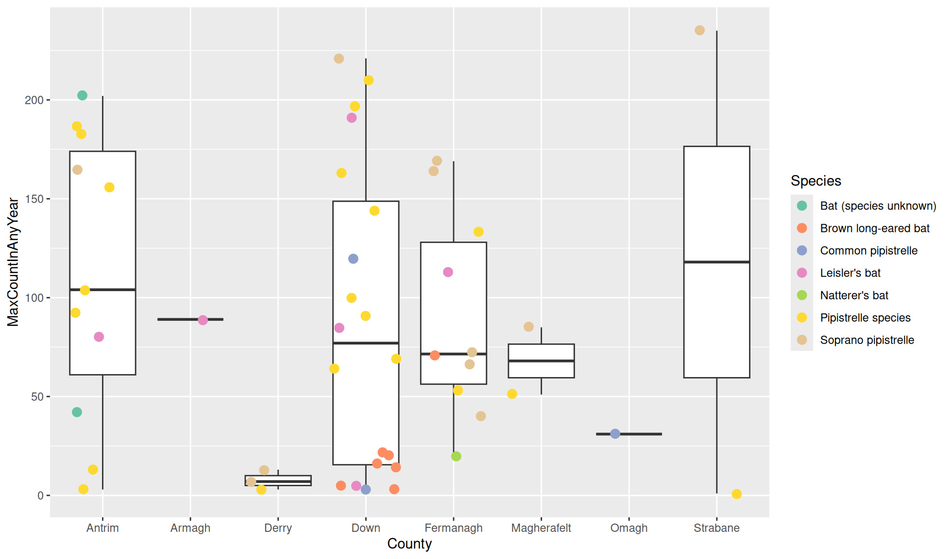
Manual colour
I am a fan of using other colour palettes outside of ggplot2’s options with the component ggplot2::scale_colour_manual().
scale_colour_manual() web page
Colour blind friendly palettes
With the component I like to utilise colour blind friendly palettes. Specifically I use palettes from:
Colouring for Colour blindness by David Nichols
Below are the three palettes in the above link. They have been assigned as vectors that can be easily used with ggplot2::scale_colour_manual(). I like to save them as objects so they can be used for multiple plots easily.
Note: The colours are assigned as hexadecimal values. If you want more information on this please see: wikipedia page on web colours
#IBM with 5 colours
ibm_pal <- c("#648fff","#785ef0","#dc267f","#fe6100","#ffb000")
#Wong with 8 colours
wong_pal <- c("#e69f00","#56b4e9","#009e73","#f0e442",
                "#0072b2","#d55e00","#cc79a7","#000000")
#Tol with 8 colours
tol_pal <- c("#332288","#117733","#44aa99","#88ccee",
                "#ddcc77","#cc6677","#aa4499","#882255")
Colour blind friendly plot
Create the boxplot with a layer of jittered points. We’ll colour the points with the Wong palette (wong_pal) using the component ggplot2::scale_colour_manual() and the argument values=.
#Boxplot of max population count in bat colonies within counties of Northern Ireland
bat_roost_tbl |>
    #Filter to only retain Northern Ireland rows
    dplyr::filter(Country == "Northern Ireland") |>
    #Box plot
    ggplot2::ggplot(aes(y = MaxCountInAnyYear, x = County)) +
    ggplot2::geom_boxplot() +
    ggplot2::geom_jitter(aes(colour=Species), size=3) +
    #Manually use wong colour palette
    ggplot2::scale_colour_manual(values = wong_pal)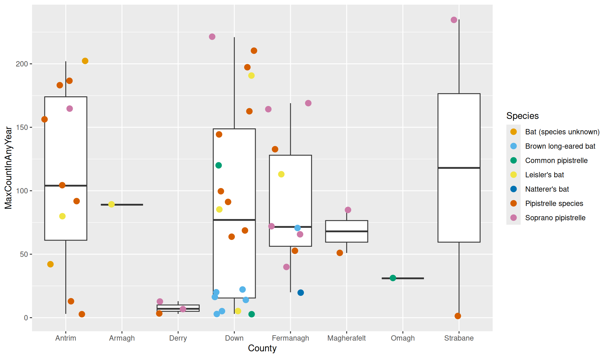
Fill aesthetic
The colours used for the fill aesthetic can be changed.
Fill with colour brewer
The function ggplot2::scale_fill_brewer() can set the colour for the fill aesthetic to a colour brewer palette.
bat_roost_tbl |>
  #Filter to only retain Northern Ireland rows
  dplyr::filter(Country == "Northern Ireland") |>
  #Box plot of MaxCountInAnyYear against County
  #Fill colour based on County
  ggplot2::ggplot(aes(x=County, y = MaxCountInAnyYear, fill = County)) +
  geom_boxplot() +
  #Use Colour brewer set1 palette for fill aesthetic
  ggplot2::scale_fill_brewer(palette="Set1")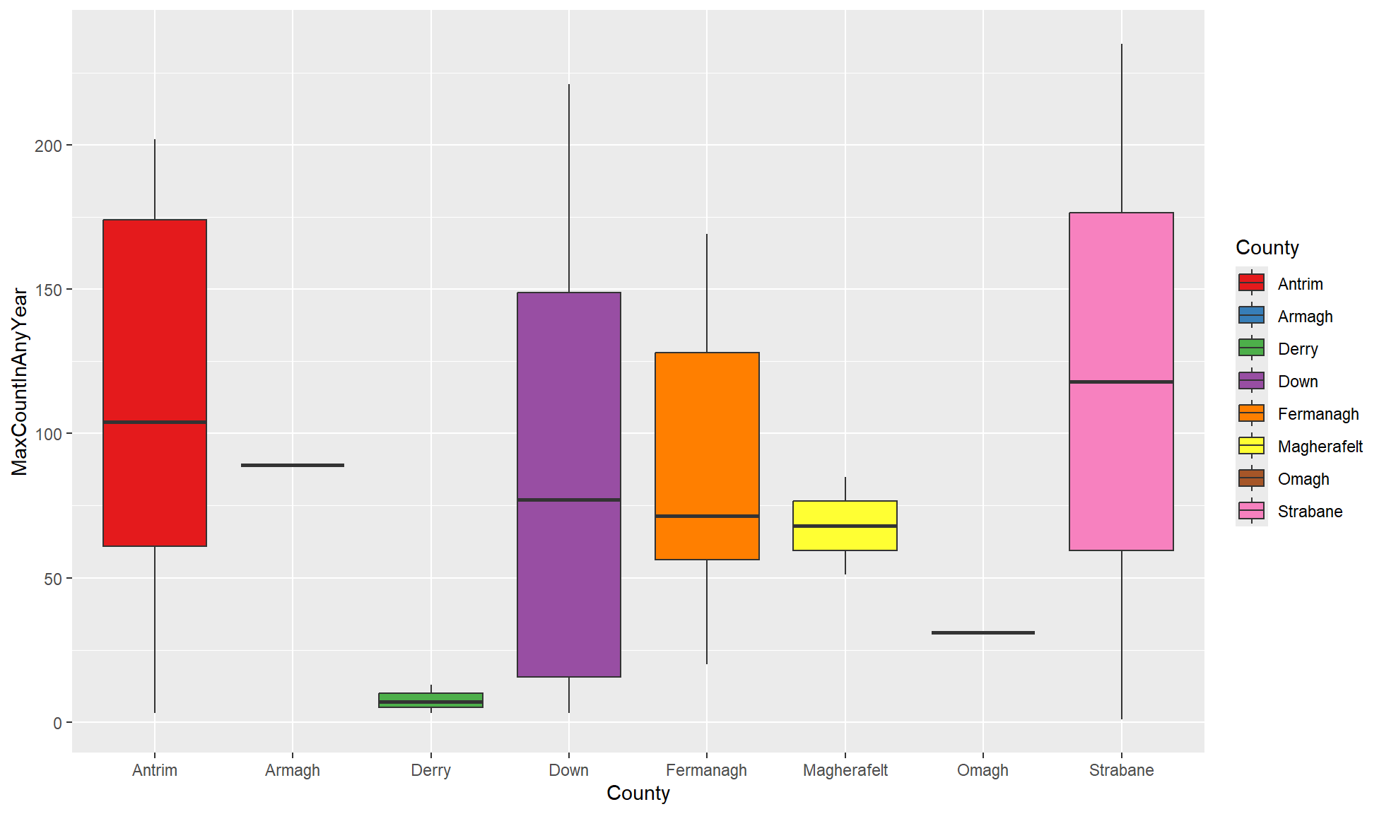
Fill with manual palette
The function ggplot2::scale_fill_manual() can set the colour for the fill aesthetic to a manually created palette.
#Vector for Tol palette
tol_pal <- c("#332288","#117733","#44aa99","#88ccee",
                "#ddcc77","#cc6677","#aa4499","#882255")
#ggplot box plot
bat_roost_tbl |>
  #Filter to only retain Northern Ireland rows
  dplyr::filter(Country == "Northern Ireland") |>
  #Box plot of MaxCountInAnyYear against County
  #Fill colour based on County
  ggplot2::ggplot(aes(x=County, y = MaxCountInAnyYear, fill = County)) +
  geom_boxplot() +
  #Use manually created palette for fill aesthetic
  ggplot2::scale_fill_manual(values=wong_pal)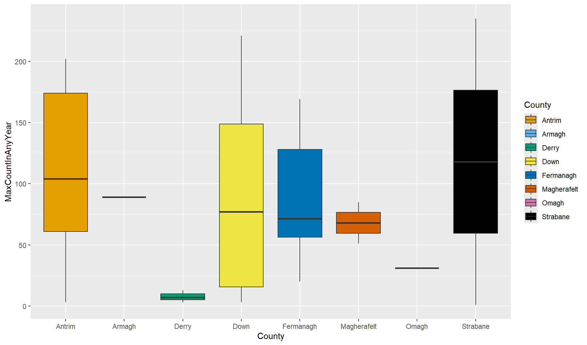
Number of colours
An important note when choosing palettes is that you need as many colours as you have groupings. The colour blind friendly palettes only have a maximum of 8 colours so if you have more you will need to use another palette. Of course once you start to have lots of groups it can be hard to differentiate between a lot of colours. If this is the case you may need to split up groups in different ways such as with facetting.