Chapter 16 Heatmap

Now that we have our combined, unstratified, and normalised table, we can visualise the dataset to see how the two groups compare.
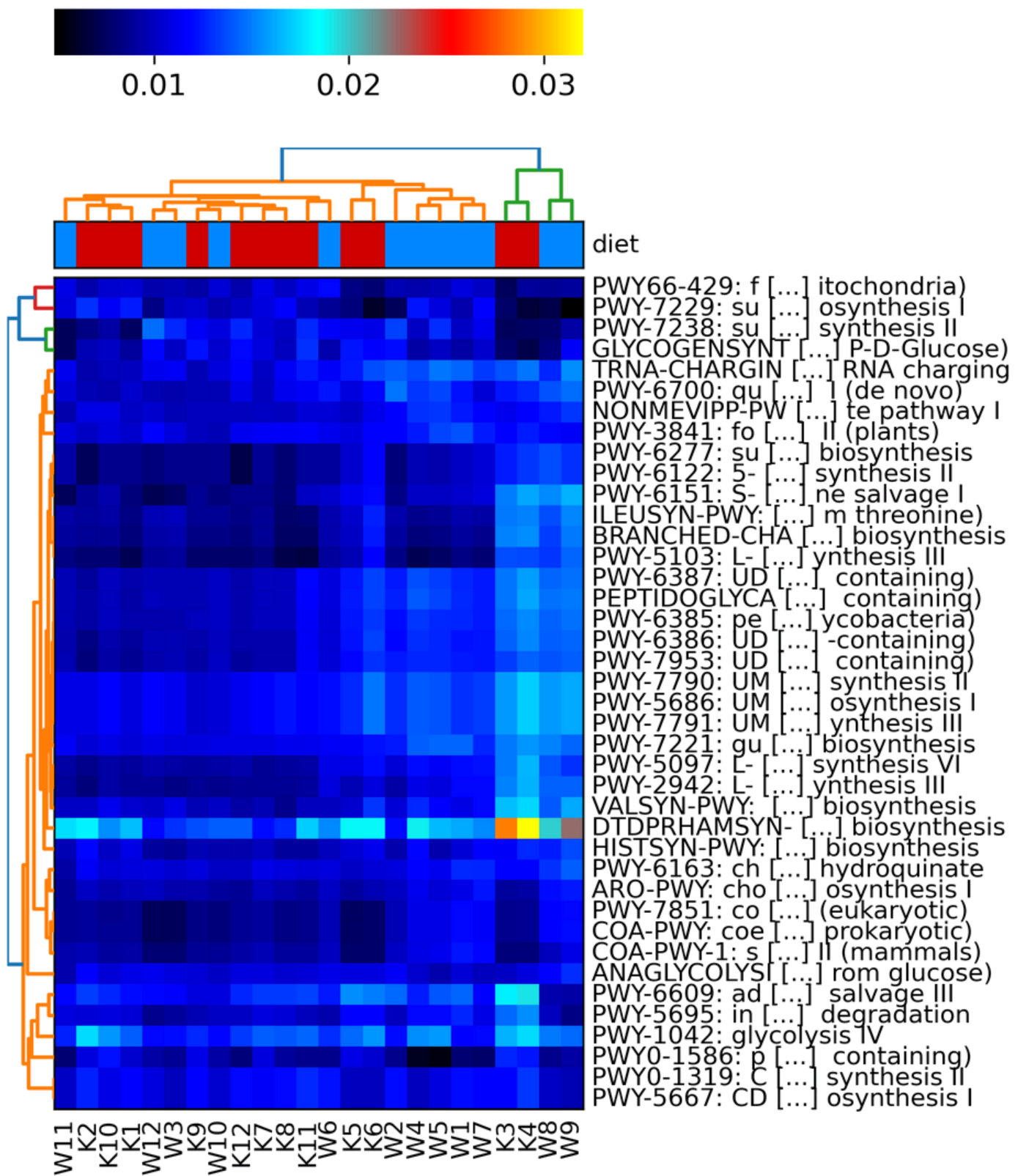
- Do samples in the same diet group appear to correlate well with each other?
- Are samples from one diet group distinguishable from those from the other diet group?
To visualise this we will create a heatmap with hclust2.
16.1 File edit
Before carrying out the command we will need to edit the file. Carry out the following alterations:
Remove the _Abundance part of the sample names whilst creating a copy that we will use (It is always a good idea to keep the original file in case a mistake happens).
Next using your text editor of choice (we recommend nano) carry out the following changes on the file diet_unstratified.relab.comp.tsv.
- Remove the
#(including the one space after the#) from the start of the header so it starts asPathway - Add in the same metadata line as we did for 12.1 but this time below the header line, i.e. as the 2nd line (ensure you are using tabs instead of spaces)
Your top 2 lines of diet_unstratified.relab.comp.tsv should then look like the below (fields/columns are separated by tabs):
Pathway K10 K11 K12 K1  K2  K3  K4  K5  K6  K7  K8  K9  W10 W11 W12 W1  W2  W3  W4  W5  W6  W7  W8  W9
diet  K K K K K K K K K K K K W W W W W W W W W W W W
Intro to unix links:
16.2 hclust2
Now we can use the hclust2 tool to create a heatmap of our pathway abundances.
hclust2.py \
-i diet_unstratified.relab.comp.tsv \
-o diet_unstratified.relab.heatmap.png \
--ftop 40 \
--metadata_rows 1 \
--dpi 300
Note: You will get 2 MatplotlibDeprecationWarnings, these are normal and can be ignored. However, ensure these are the only warnings/errors before continuing.
Parameters
-i: The input table file.-o: The output image file. The tool does not specify what types of image files you can use but.pngis always a good image file format.--ftop: Specifies how many of the top features (pathways in this case) to be included in the heatmap.--metadata_rows: Specifies which row/s contain the metadata information to be used for the group colouring at the top of the heatmap.- Row numbers start at 0 for this tool. Therefore our sample names are in row 0 and the diet info is in row 1.
- Multiple rows can be specified if you have multiple rows of metadata.
- e.g.
--metadata_rows 1,2,3.
- e.g.
--dpi: The image resolution in dpi (dots per inch). 300 dpi is used for publication quality images.
There are many more options that can be seen on the hclust2 github.
Visualise
Now we can view the plot.
From this, we can see that there is a small amount of clustering caused by the differences between the Korean and Western diet. Other factors that we do not know about the samples must also be casuing an effect. This is normal as we cannot account for everything but it is good to try to account for as much as possible.
Note: Your plot should look the same as the below. If it does not you may not have carried out the file edit step correctly.